How to Write a Perfect Essay About Website Analysis
Learn how to craft a high-quality essay about website design and analysis. Follow our 2026 guide for expert tips, structural advice, and a full sample essay.
You open the assignment sheet, read “write an essay about website analysis,” and suddenly every website you've ever used turns into a blur of buttons, banners, pop-ups, and one cookie notice that somehow covers the entire screen like a clingy blanket.
That reaction is normal.
Most students hear “essay” and think thesis statement, three body paragraphs, done. But a website isn't a static object like a poem or a painting. It moves. It asks users to click, scroll, trust, buy, subscribe, and sometimes rage-quit when the menu vanishes on mobile. Writing a strong essay about website means learning to analyze something people use, not just something they passively read.
That makes this assignment more useful than it sounds. If you're a student, marketer, designer, developer, researcher, or just a person who has ever whispered “who built this monstrosity?” at a bad homepage, website analysis teaches you how digital communication works in real life.
So You Have to Write an Essay About a Website
A lot of students freeze because the prompt sounds weirdly broad. Are you supposed to summarize the website? Judge the design? Talk about whether the colors are “nice”? That last one is how essays drift into vague fluff very fast.
The better move is to treat the site like evidence.

A website leaves clues everywhere. The homepage shows what the brand wants you to notice first. The navigation reveals what the creators think matters most. The wording tells you who they're trying to persuade. The layout shows whether they respect your eyeballs. Even the loading behavior says something, usually either “welcome” or “please suffer.”
There's a practical reason this skill matters. As of early 2026, there are over 201 million active websites competing for attention, with around 252,000 new ones launching every single day, according to . In a crowded web, being able to explain why one site works and another falls apart is a real-world skill, not just homework.
What your instructor probably wants
Most assignments like this are really asking whether you can do three things:
- Observe carefully by noticing design, writing, structure, and user flow
- Make an argument instead of listing features like a bored tour guide
- Support claims with evidence from the website itself
Practical rule: Don't write “the website is good” or “the website is bad.” Write what the site is trying to do, how it does it, and where it succeeds or fails.
If you need help deciding whether a website's claims feel trustworthy, this guide on is useful because website analysis overlaps with source evaluation more than most students expect.
A smarter way to think about the assignment
Pretend you're part writing tutor, part UX analyst, part digital detective. You're not reviewing a website like a customer leaving a star rating after a coffee-fueled shopping spree. You're analyzing how the site functions as communication.
That shift changes everything. It turns the paper from “I guess this looks modern?” into an argument with teeth.
The Four Lenses of Website Analysis
Good analysis starts before you write a sentence. Open the website and study it through four lenses: design, usability, content, and purpose. If you skip one, your essay usually ends up lopsided.

The framework that keeps you from writing mush
That table gives you your note-taking map. Now make it concrete.
Lens one and two matter more than students think
Design is not just decoration. A page can be visually polished and still communicate badly. Ask whether the design guides attention or scatters it. Good design helps users know what to do next. Weak design creates that “where am I supposed to click?” feeling.
Usability gets even more interesting when you look at technical performance. Professional website evaluation often includes First Contentful Paint (FCP) and DOMContentLoaded (DCL), and connection speed is a top-three criterion alongside accessibility and usability, according to . In plain English, if the page makes users wait, many of them won't stick around long enough to admire the branding.
A pretty homepage that loads awkwardly is like a beautiful store with a jammed front door.
If you want a practical companion piece from the business side, this offers a useful outside perspective on what site owners examine when they're trying to improve results.
Lens three and four turn observation into argument
Content analysis means paying attention to more than grammar. Look at headlines, product descriptions, button text, tone, and how information is grouped. Ask whether the writing helps users decide, understand, or trust. If the site says a lot without saying much, that's worth pointing out.
Purpose ties the whole essay together. Every site has a main job, even if the creators buried it under six sliders and a heroic stock photo of someone laughing at salad. Your essay gets stronger when you identify that core goal and judge every design choice against it.
A practical way to deepen this stage is to compare your notes across similar sites. If you need help building that kind of side-by-side reasoning, this guide on is handy.
A simple note-taking method
Try this while browsing the site:
- Homepage pass: Write what you notice in the first few seconds
- Navigation pass: Click the menu and test whether major pages make sense
- Content pass: Copy down exact phrases, headings, and calls to action
- Purpose pass: Ask what action the site pushes hardest and whether the experience supports it
That gives you evidence. Essays earn grades with evidence, not vibes.
How to Structure Your Essay (Hint It's Not a 5-Paragraph Burger)
The old school five-paragraph format works for some assignments. It's tidy. It's familiar. It's also a terrible fit for many website essays because websites are not experienced in neat, linear order.

Users don't move through a site like they move through a traditional essay. They search, skim, bounce between tabs, compare reviews, and check whether the site's promises survive contact with reality. Research on web consumption points to a structural mismatch between classical essay logic and how people discover content through search and algorithms, as discussed in .
That means your essay about website analysis should be organized around how the site functions, not around a middle-school hamburger paragraph diagram that should've retired years ago.
Better structures than intro body body body conclusion
Here are formats that usually work better:
User journey structure
Start with the landing experience, then move through navigation, content, and final call to action. This works well for service sites, university pages, and online stores.Thematic critique
Group your analysis by trust, usability, messaging, and design consistency. This works well when the site has clear strengths and weaknesses in separate areas.Expectation versus reality
Begin with what the website promises, then analyze whether the design and content support those claims. This is especially strong for brand-heavy websites.
The best structure is the one that helps your reader follow your argument, not the one that lets you mechanically fill five boxes.
Build around a claim, not a checklist
A weak essay sounds like this: the website has a homepage, a menu, images, and text. True. Also painfully unhelpful.
A stronger essay sounds like this: the website presents itself as trustworthy and user-friendly, but confusing navigation and vague copy weaken that message. That's an argument. Once you have that, each paragraph can prove part of it.
If your notes are messy, that's normal. It is common to gather website observations in random fragments. One practical trick is to dump bullet points into a writing workspace and sort them by theme before drafting. A tool like Zemith's Smart Notepad can turn rough notes into organized paragraph drafts, then let you rewrite for your own voice instead of staring at a blank page like it personally insulted you.
A useful model for body paragraphs
Try this pattern:
- Make a claim
- Point to specific website evidence
- Explain why it matters for users
- Connect it back to your thesis
That's the move. Not description for its own sake.
For paragraph-level cleanup, this guide on helps when your draft feels choppy or repetitive.
A quick visual explanation can help too:
Don't ignore the trust problem
One of the smartest angles in a website essay is to ask whether the site expects too much trust. Users often verify claims elsewhere instead of accepting a polished “About” page at face value. So if a website makes bold promises but offers little proof, your essay can call that out.
That's the difference between student-level summary and analysis that sounds informed.
Sample Essay Analyzing “ArtisanAura.com”
Theory gets easier once you see it on the page. Below is a short sample essay about a fictional handmade-goods website called ArtisanAura.com.
Sample essay
ArtisanAura.com presents itself as an elegant marketplace for handcrafted goods, and its strongest feature is its visual branding. However, while the website succeeds in creating a warm, boutique-style identity, its user experience and product communication sometimes make shopping harder than necessary. The site is effective as a brand showcase, but less effective as a friction-free buying experience.
The website's design creates a clear first impression. Soft neutral colors, large product photography, and generous white space suggest care, craftsmanship, and exclusivity. These choices match the handmade theme well. Rather than overwhelming visitors with discount banners or crowded menus, the homepage gives each featured item room to breathe. This creates an upscale tone that supports the brand's message.
The usability is less consistent. While the navigation bar includes expected categories such as home decor, ceramics, and gifts, some subcategories are difficult to scan quickly. A user looking for a specific item may need to click through several pages before finding relevant filters. Product pages also place visual elements above practical details, which means shoppers may see attractive images before they see shipping information, material descriptions, or return policies. That choice favors mood over clarity.
The website's content is strongest when it explains the story behind a product. Several item descriptions connect objects to the artisans who made them, which helps distinguish the site from mass-market competitors. Still, some copy relies on broad phrases like “timeless beauty” and “crafted with love,” which sound pleasant but do little to inform the buyer. Specific details such as dimensions, materials, and care instructions create more trust than decorative language alone.
ArtisanAura.com appears designed for users who value aesthetics and artisan identity, but its purpose is divided between storytelling and selling. When those goals work together, the site feels persuasive. When visual presentation pushes practical information too far down the page, the shopping process becomes slower. Overall, the website succeeds as a brand experience but would be stronger if it balanced emotional appeal with clearer usability and more specific product content.
Why this sample works
Notice what the essay does right:
- It has a clear thesis instead of a vague opinion
- It uses evidence from the fictional site rather than generic praise
- It balances strengths and weaknesses so the tone sounds fair
- It evaluates purpose instead of only describing appearance
Good website analysis sounds like judgment supported by observation, not like a homepage recap.
If you want to sharpen your eye for modern site-building choices, this is a useful read because it shows how design tools influence the websites people end up writing about.
A template you can copy
Use this sentence frame if you're stuck:
- Introduction: The website aims to do X, and it succeeds or fails because of Y and Z.
- Body paragraph 1: Analyze the visual design and first impression.
- Body paragraph 2: Evaluate navigation, usability, and flow.
- Body paragraph 3: Assess content quality, tone, and credibility.
- Conclusion: Judge whether the site fulfills its purpose for its audience.
That's flexible enough for most assignments and much smarter than forcing every site into a rigid five-paragraph cage.
The Final Polish Your Pre-Submission Checklist
Draft finished? Good. Don't submit it yet.
Most website essays lose points in revision, not in ideas. Students often have decent observations but weak wording, unsupported claims, or paragraphs that wander off like a broken menu link.

Your fast quality-control pass
Run through this checklist before you hit submit:
- Check your thesis: Does it make a real argument, or does it just say the site exists and has pages?
- Verify your evidence: Did you point to actual features, wording, layout choices, or user experience moments from the site?
- Trim empty praise: Delete lines like “the website is very informative and interesting” unless you explain why.
- Test your transitions: Make sure paragraphs connect logically instead of jumping around like ten browser tabs open during finals week.
- Proofread names and URLs: If you misspell the website name, your credibility falls fast.
- Review citations: Use the citation style your class requires and keep it consistent.
Read it like a skeptical grader
A useful trick is to read each paragraph and ask, “Would a stranger believe this without more proof?” If the answer is no, add an example.
For final editing help, this guide on is worth bookmarking. It's especially helpful when your draft sounds repetitive or padded.
One clean, specific sentence beats three fluffy ones every time.
Also, read the essay out loud. If you run out of breath in the middle of a sentence, your reader probably will too.
Frequently Asked Website Essay Questions
How do I cite a website in an essay?
Use the citation style your instructor requires, usually MLA or APA. The exact format depends on author, page title, site name, publication date, and URL. If the page has no named author, follow the style guide's rules for that situation. Don't guess. Check your course handbook or library guide.
Can I write about a bad website?
Indeed, bad websites are often easier to analyze. Problems provide clearer evidence. Confusing navigation, weak writing, cluttered design, and trust issues all offer material to evaluate. Just ensure you are analyzing rather than roasting. You are writing an essay, not posting a spicy comment thread.
What if my professor didn't give a word count?
Look at the complexity of the assignment. A short response can usually focus on one central claim with a few examples. A longer paper should cover multiple lenses such as design, usability, content, and purpose. If you're unsure, ask. Professors usually prefer a quick question over a wildly wrong submission.
Should I paraphrase website text or quote it?
Usually both. Paraphrase when you're summarizing the site's general message. Quote short phrases when the exact wording matters. If you're worried about accidental copying, this guide on can help.
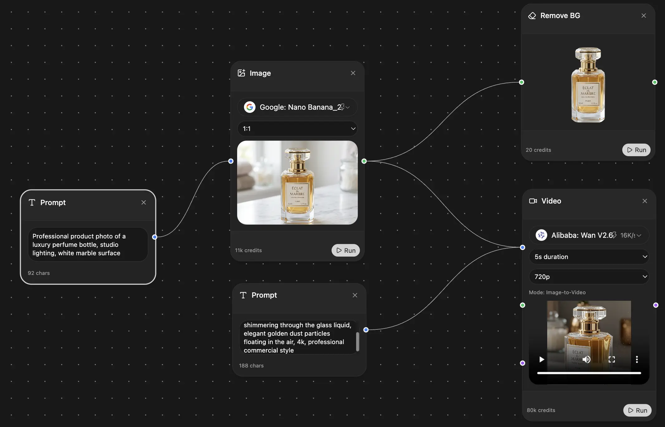
If you're turning scattered notes, screenshots, and half-formed ideas into a polished essay, can help you do the boring parts faster. You can organize research, draft from bullet points, refine paragraphs, and review clarity in one workspace without bouncing between a pile of tabs like a lost freshman on syllabus week.
Explore Zemith Features
Every top AI. One subscription.
ChatGPT, Claude, Gemini, DeepSeek, Grok & 25+ more


Always on, real-time AI.
Voice + screen share · instant answers
What's the best way to learn a new language?
Immersion and spaced repetition work best. Try consuming media in your target language daily.
Voice + screen share · AI answers in real time
Image Generation
Flux, Nano Banana, Ideogram, Recraft + more

Write at the speed of thought.
AI autocomplete, rewrite & expand on command
Any document. Any format.
PDF, URL, or YouTube → chat, quiz, podcast & more
Video Creation
Veo, Kling, Grok Imagine and more

Text to Speech
Natural AI voices, 30+ languages
Code Generation
Write, debug & explain code
Chat with Documents
Upload PDFs, analyze content
Your AI, in your pocket.
Full access on iOS & Android · synced everywhere
Your infinite AI canvas.
Chat, image, video & motion tools — side by side
Save hours of work and research
Transparent, High-Value Pricing
Trusted by teams at
Free
No credit card required
- 100 credits daily
- 3 AI models to try
- Basic AI chat
Plus
- 1,000,000 credits/month
- 25+ AI models — GPT, Claude, Gemini, Grok & more
- Agent Mode with web search, computer tools and more
- Creative Studio: image generation and video generation
- Project Library: chat with document, website and youtube, podcast generation, flashcards, reports and more
- Workflow Studio and FocusOS
Professional
- Everything in Plus, and:
- 2,100,000 credits/month
- Pro-exclusive models (Claude Opus, Grok 4, Sonar Pro)
- Motion Tools & Max Mode
- First access to latest features
- Access to additional offers
What Our Users Say
Great Tool after 2 months usage
"I love the way multiple tools they integrated in one platform. Going in the right direction."
— simplyzubair
Best in Kind!
"The quality of data and sheer speed of responses is outstanding. I use this app every day."
— barefootmedicine
Simply awesome
"The credit system is fair, models are perfect, and the discord is very responsive. Quite awesome."
— MarianZ
Great for Document Analysis
"Just works. Simple to use and great for working with documents. Money well spent."
— yerch82
Great AI site with accessible LLMs
"The organization of features is better than all the other sites — even better than ChatGPT."
— sumore
Excellent Tool
"It lives up to the all-in-one claim. All the necessary functions with a well-designed, easy UI."
— AlphaLeaf
Well-rounded platform with solid LLMs
"The team clearly puts their heart and soul into this platform. Really solid extra functionality."
— SlothMachine
Best AI tool I've ever used
"Updates made almost daily, feedback is incredibly fast. Just look at the changelogs — consistency."
— reu0691