How to Generate Images with AI: The 2026 Guide
Learn how to generate images with AI that look incredible. Our 2026 guide covers prompt crafting, advanced settings, & pro workflows. Stop generic AI art!
You typed a prompt. The AI gave you a person with too many fingers, a background that looks like it was painted during a caffeine emergency, and somehow a shoe floating in the sky.
That’s normal.
It's often assumed that how to generate images with ai is about finding the right magic prompt. It isn’t. Good results come from a workflow. You pick the right model, write prompts like a director instead of a casual texter, tweak a few settings on purpose, then refine instead of restarting from scratch every time something looks weird.
That matters more now because this isn’t a toy category anymore. The . If you work in marketing, design, ecommerce, product, education, or development, this skill is turning into a practical career advantage.
Your Journey from AI Art Zero to Hero
The first ugly generations are part of the process. A lot of beginners quit too early because they assume the model is bad, or they’re bad at prompts, or the whole thing is overhyped. Usually none of that is true. They just haven’t learned the loop yet.

What separates clean, polished AI visuals from cursed internet experiments is simple. Pros don’t stop at generation one. They choose a model based on the job, structure the prompt, test variations, then fix the result with targeted edits.
What usually goes wrong first
- The prompt is too vague. “Cool futuristic city” gives the model too much room to freestyle.
- The model is mismatched. Some models are stronger at realism, some at stylization, some at composition.
- The user keeps re-rolling. That’s the fastest route to wasting time.
- No refinement happens. A nearly-good image is much more valuable than a fresh blank attempt.
You’re not trying to get lucky. You’re trying to become repeatable.
That shift changes everything. Once you start treating image generation like art direction instead of gambling, results get better fast. The rest of this guide follows the way working creatives do it, with model choice, prompt structure, advanced controls, and edits that clean up the details most beginners leave broken.
Choosing Your AI Model Inside Zemith
A lot of frustration starts with the wrong model. People blame prompting when the actual issue is that they picked a tool that isn’t suited to the look they want.
Inside one workspace, it helps to think of models like different lenses or paint sets. Stability Diffusion 3.5 tends to feel practical for photoreal scenes and iterative edits. Imagen 3 is useful when prompt-following matters more than surprise. Flux 1.1 Pro Ultra is the one many people reach for when they want stronger aesthetics and more confident scene composition.

What the model is actually doing
Under the hood, AI image generation runs on diffusion models. They start with random noise, then refine it over 20 to 50 steps into an image that matches the prompt, using a U-Net to predict and remove noise at each stage, as explained in .
That sounds technical, but the practical takeaway is easier: the model is making thousands of tiny decisions based on your prompt. If your instructions are muddy, the image will be muddy too.
A simple model cheat sheet
If you work on outdoor concepts, property mockups, or before-and-after visuals, it’s worth seeing how other niche workflows approach prompts and composition. This breakdown of is a useful example because exterior prompts expose weak composition faster than portraits do.
Start with one test prompt
Don’t open with your dream campaign visual involving reflective chrome armor, six characters, rain, neon signage, dramatic typography, and a corgi wearing tactical goggles. That’s how you end up arguing with pixels.
Start with something narrow:
- Subject: a vibrant colorful chameleon
- Setting: on a tree branch
- Style: photorealistic
- Lighting: natural daylight
- Composition: close-up, shallow depth of field
That becomes:
photorealistic close-up of a vibrant colorful chameleon on a tree branch, natural daylight, shallow depth of field, detailed skin texture, tropical background blur
Generate that prompt in two or three different models. Don’t judge the winner by vibes alone. Look for:
- Prompt adherence. Did it make a chameleon and not a lizard cousin with trust issues?
- Texture quality. Are scales, bark, and lighting believable?
- Composition control. Does the framing feel intentional?
- Cleanup burden. Which result needs less fixing later?
For a broader comparison of model options before you commit to a workflow, this roundup of helps survey the available options.
A quick visual walkthrough helps here too:
What works and what doesn’t
Works
- Testing the same prompt across multiple models
- Starting with a simple scene
- Choosing the model based on the output goal, not brand hype
Doesn’t work
- Switching prompts and models at the same time
- Judging a model from one bad generation
- Using the same model for every job out of habit
Practical rule: Change one variable at a time. If you swap the model, keep the prompt stable. If you rewrite the prompt, keep the model stable.
That one habit saves a ridiculous amount of time.
The Art of the Prompt Be the Director
Beginners ask for images. Professionals direct them.
That’s the cleanest mindset shift I know. If you type prompts the way you text a friend, the model fills in too many blanks. If you prompt like a director building a shot, the image gets sharper fast.

The six-part prompt structure
The easiest prompt formula to reuse is:
[Subject] + [Style or medium] + [Action or setting] + [Composition or framing] + [Lighting] + [Color or mood]
Here’s the difference.
Weak prompt:
a cat
Better prompt:
photorealistic long shot of a ginger tabby cat lounging on a sun-drenched windowsill, soft morning light, shallow depth of field, warm neutral tones, cinematic composition
The second one gives the model real decisions to follow. Subject, camera distance, environment, time of day, and visual mood are all pinned down.
Think in visual layers
When a prompt feels flat, it usually needs more visual categories, not more random adjectives. Build from these layers:
- Subject layer. Who or what is the focus?
- Environment layer. Where is it happening?
- Camera layer. Close-up, wide shot, low angle, overhead, profile?
- Light layer. Soft daylight, dramatic rim light, moody tungsten, overcast?
- Finish layer. Photorealistic, watercolor, editorial, anime, matte painting?
Try this progression:
Basic
astronaut in a desertDirected
lone astronaut standing in a vast desert at sunsetUsable
photorealistic lone astronaut standing in a vast desert at sunset, wide-angle composition, wind blowing sand, dramatic orange sky, cinematic lighting, detailed suit reflections
The third version gives the model enough structure to make choices that feel deliberate.
Composition language matters more than people think
A lot of image quality problems are really composition problems. If you want results that feel more designed, use framing terms on purpose:
- Close-up for faces and object detail
- Medium shot for character plus environment balance
- Wide shot for expansive views and scene storytelling
- Low angle for power
- Top-down for product layouts
- Centered composition for symmetry
- Rule of thirds when you want editorial balance
If you’re still experimenting with prompt patterns, is useful for seeing how different generators respond to beginner and intermediate prompts.
Bad prompts ask for a thing. Good prompts describe a frame.
Negative prompts are your cleanup crew
Negative prompts tell the model what to avoid. They won’t fix everything, but they reduce recurring mistakes.
Useful negative prompt terms include:
- bad anatomy
- extra limbs
- extra fingers
- blurry
- deformed
- duplicate subject
- poorly drawn hands
- cropped
- text
- watermark
Don’t dump in a giant negative prompt list just because you found one on a forum from a person named UltraWizard9000. Keep it relevant. For a portrait, anatomy matters. For a logo concept, text artifacts and weird edges matter more.
Prompt examples that actually improve output
Here’s a compact before-and-after table:
Use image references when words fail
Sometimes you know the look you want but can’t describe it. That’s normal. A lot of strong prompting starts from visual reference, not pure language.
One practical shortcut is using an image analysis workflow to reverse-engineer a prompt from a reference image, then editing that prompt to fit your own concept. If you want examples of prompt structures worth stealing and adapting, this gallery of is a good starting point.
My rule for writing stronger prompts
I check every prompt against this list before hitting generate:
- Can the model identify one clear subject?
- Does it know the environment?
- Is the camera viewpoint obvious?
- Did I specify light?
- Did I give it a style target?
- Do I need a negative prompt?
If two of those are missing, the result usually looks generic.
And generic is the actual enemy here. Not because it’s ugly, but because it wastes your time. You don’t want “an image.” You want the image that already exists in your head, or at least something close enough to refine instead of abandon.
Mastering Advanced Settings Without a PhD
Prompts decide the scene. Settings decide how tightly the model sticks to that scene, how repeatable your result is, and how much room you leave for happy accidents.
At this point, a lot of users either freeze or go full chaos goblin. Neither helps.

The four-part workflow pros actually use
Professional image generation often follows Define, Explore, Refine, and Export. In that workflow, experts generate 20 to 80 variations to find a result that matches their vision, and iterative refinement can improve final quality by as much as 65%, according to .
That sounds like a lot until you realize what it means in practice. The goal isn’t to make one perfect image on the first click. The goal is to create a controlled search process.
Seed is your image fingerprint
A seed is the starting pattern behind a generation. Keep the same seed and most of the image DNA stays related. Change the seed and you’re asking for a fresh branch of possibilities.
Use seed when you want:
- Character consistency across variations
- Composition continuity while changing style details
- A saved good structure that you can keep refining
If you get a near-perfect image, save the seed. Future-you will thank present-you for not treating good results like disposable lottery tickets.
Guidance is the creativity leash
Guidance, sometimes called CFG, controls how strictly the model follows the prompt.
Here’s the practical version:
If your outputs feel boring and overforced, the guidance may be too high. If the model keeps wandering off and inventing nonsense, raise it a bit.
Field note: When a prompt is already detailed, cranking guidance too hard can make the image feel rigid instead of better.
Samplers change the texture of the result
You do not need to understand the math behind samplers. You only need to know they affect how the denoising path behaves, which changes the final feel of the image.
Some samplers feel:
- faster and rougher
- smoother and more polished
- more faithful to the prompt
- better at preserving subtle detail
When I’m testing a scene that already has a solid prompt and stable seed, changing the sampler is one of the fastest ways to get a different mood without rewriting everything.
Resolution and framing choices matter early
Don’t treat aspect ratio like an afterthought. A portrait idea forced into a wide layout often looks awkward. A product banner generated square can feel cramped.
Pick the frame based on the use case:
- Portrait orientation for character art, posters, social stories
- Square for feeds, thumbnails, concept exploration
- Wide for hero images, headers, cinematic scenes
If your composition is good but clipped at the edges, extend it instead of rebuilding it from nothing. This guide to is useful when you need more canvas for banners, thumbnails, or ad layouts.
What to tweak first
Don’t touch every knob at once. Use this order:
- Fix the prompt if the subject or scene is wrong.
- Change guidance if the model is too wild or too stiff.
- Lock the seed once you find a promising composition.
- Try a different sampler for texture and finish.
- Adjust framing or resolution for the final use case.
That order keeps you from chasing five variables at once and learning nothing.
The main thing advanced settings give you is control. Not perfection. Control is better.
The Iterative Workflow Refine Dont Redo
The fastest way to stay mediocre with AI images is to keep smashing Generate and hoping the machine suddenly reads your mind.
The better move is to treat the first output as a draft. That’s how a lot of creative professionals already think about generative AI. In Adobe’s survey, 71% of creative pros expected to use generative AI for professional work, and 53.6% viewed their input and iteration as fundamental to the creative process, not optional cleanup, as reported in .
A realistic example
Say you generate a campaign image for a running shoe. The composition is strong. The lighting is good. The shoe looks premium. But the laces are weird, one hand is slightly mangled, and there’s a mystery blob in the corner that looks like the model tried to invent a new species of water bottle.
Don’t redo it.
Use image-to-image to feed that decent draft back in with a tighter prompt. Keep the structure you like, then ask for corrections in the areas that drifted. That’s faster than rolling new generations until luck returns.
The three edits I reach for most
Image-to-image for structural improvement
Best when the whole image is close, but style, detail, or coherence needs tightening.Inpainting for local fixes
Mask the bad hand, broken jewelry, odd facial feature, or warped object and regenerate only that area.Object cleanup for distraction removal
Remove the random background clutter that pulls attention away from the primary subject.
A unified workflow proves helpful. If you’re building your own prompt library from successful images, converting finished visuals back into reusable prompt language is handy. A guide like is useful for that because it turns one good result into a repeatable process.
The first image proves the idea. The refined image becomes the deliverable.
What refinement usually fixes
Here’s what I expect to repair after generation one:
A lot of beginners think refinement means the model failed. It doesn’t. It means you’re using it like a working creative tool instead of a slot machine.
That’s the big unwritten rule. Don’t chase perfect from zero. Protect what already works, then improve the weak parts.
Using AI Images Legally and Ethically
A generated image is not automatically safe to use just because a model made it.
That assumption gets people in trouble fast, especially in client work, ads, product packaging, and branded content. The legal picture is still shifting. The .
The practical rules I’d follow
- Check commercial-use terms first. Don’t assume every model or platform gives you the same rights.
- Avoid direct style imitation of living artists. Even if you can do it, that doesn’t make it smart or ethical.
- Don’t use AI images for deceptive edits. Fake endorsements, fake people, fake events. Bad idea.
- Keep records of your prompts and edits. If a client asks how an image was made, you want an answer.
- Be careful with logos, characters, and trademarked visual language. Models can drift into familiar territory without warning.
Where people get sloppy
The most common mistake is treating prompt originality like legal protection. It isn’t. You can write your own words and still generate something risky.
A second mistake is copying too close to a reference image. “Inspired by” turns into “suspiciously identical” quicker than most users realize.
If the image is going into paid media, packaging, a client deck, or a public campaign, review it like a professional asset, not a fun experiment.
That same mindset matters with text and brand material around the image too. If your workflow includes adapting reference copy, campaign language, or source material, this article on is relevant for the non-image side of the process.
Using AI responsibly doesn’t kill creativity. It makes the work safer to publish, easier to defend, and less likely to blow up in your inbox later.
Frequently Asked Questions and Honest Answers
Do I need to be good at art to get good at AI images
No, but you do need visual taste and patience. People with design, photography, film, or illustration instincts often improve faster because they already think about lighting, framing, and mood.
Why do my images still look generic
Usually one of three reasons. Your prompt is too broad, your model choice doesn’t fit the task, or you’re skipping refinement. Generic in, generic out.
How many generations should I expect before I get something usable
More than one. Sometimes a lot more. That’s normal. The point is to search intelligently, save good seeds, and refine strong drafts instead of restarting every time.
Is photorealism always the best goal
Not at all. Sometimes stylized imagery performs better because it feels more original, more brandable, or less uncanny. Chasing realism for everything is how you end up making very expensive-looking boredom.
What’s the biggest beginner mistake
Writing prompts like requests instead of directions. The second biggest is trying to solve every problem with more words.
What should I practice first
Practice one subject in multiple styles. Then one style across multiple subjects. That teaches you what comes from the prompt, what comes from the model, and what still needs editing.
Is one platform enough for serious work
One workspace is enough if it gives you access to several strong models plus editing tools. The main issue isn’t platform count. It’s whether you can go from generation to cleanup without breaking your workflow.
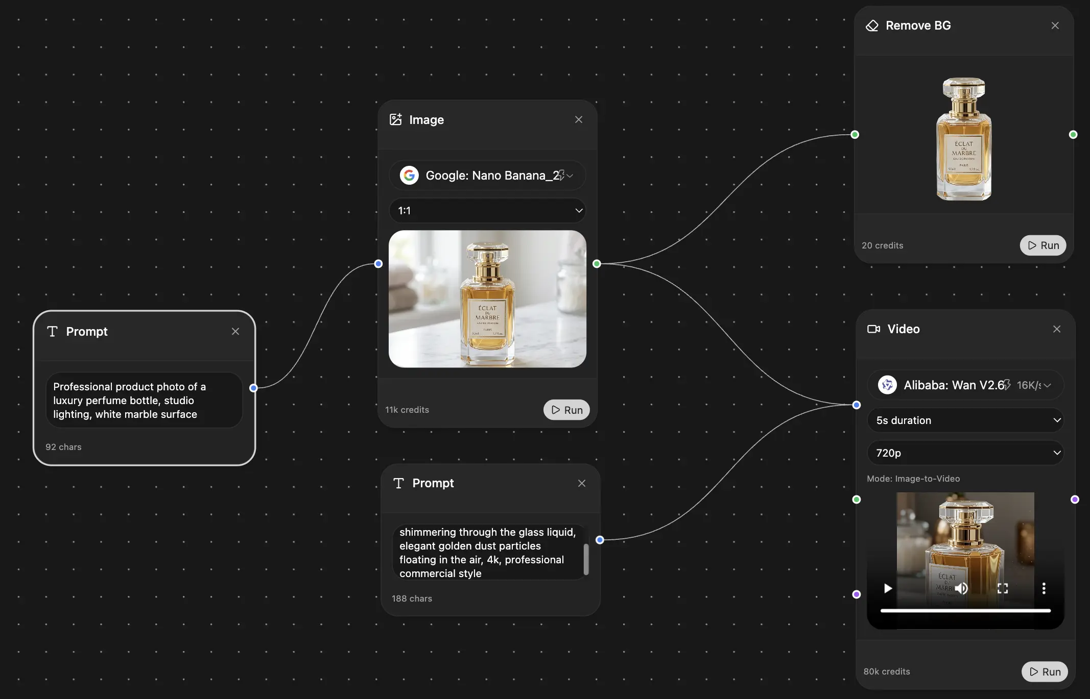
If you want one place to handle prompt writing, model switching, image generation, and follow-up edits without juggling a pile of separate tools, take a look at . It combines multiple AI models and creative utilities in one workspace, which makes the professional loop a lot easier to run consistently.
Explore Zemith Features
Every top AI. One subscription.
ChatGPT, Claude, Gemini, DeepSeek, Grok & 25+ more


Always on, real-time AI.
Voice + screen share · instant answers
What's the best way to learn a new language?
Immersion and spaced repetition work best. Try consuming media in your target language daily.
Voice + screen share · AI answers in real time
Image Generation
Flux, Nano Banana, Ideogram, Recraft + more

Write at the speed of thought.
AI autocomplete, rewrite & expand on command
Any document. Any format.
PDF, URL, or YouTube → chat, quiz, podcast & more
Video Creation
Veo, Kling, Grok Imagine and more

Text to Speech
Natural AI voices, 30+ languages
Code Generation
Write, debug & explain code
Chat with Documents
Upload PDFs, analyze content
Your AI, in your pocket.
Full access on iOS & Android · synced everywhere
Your infinite AI canvas.
Chat, image, video & motion tools — side by side
Save hours of work and research
Transparent, High-Value Pricing
Trusted by teams at
Free
No credit card required
- 100 credits daily
- 3 AI models to try
- Basic AI chat
Plus
- 1,000,000 credits/month
- 25+ AI models — GPT, Claude, Gemini, Grok & more
- Agent Mode with web search, computer tools and more
- Creative Studio: image generation and video generation
- Project Library: chat with document, website and youtube, podcast generation, flashcards, reports and more
- Workflow Studio and FocusOS
Professional
- Everything in Plus, and:
- 2,100,000 credits/month
- Pro-exclusive models (Claude Opus, Grok 4, Sonar Pro)
- Motion Tools & Max Mode
- First access to latest features
- Access to additional offers
What Our Users Say
Great Tool after 2 months usage
"I love the way multiple tools they integrated in one platform. Going in the right direction."
— simplyzubair
Best in Kind!
"The quality of data and sheer speed of responses is outstanding. I use this app every day."
— barefootmedicine
Simply awesome
"The credit system is fair, models are perfect, and the discord is very responsive. Quite awesome."
— MarianZ
Great for Document Analysis
"Just works. Simple to use and great for working with documents. Money well spent."
— yerch82
Great AI site with accessible LLMs
"The organization of features is better than all the other sites — even better than ChatGPT."
— sumore
Excellent Tool
"It lives up to the all-in-one claim. All the necessary functions with a well-designed, easy UI."
— AlphaLeaf
Well-rounded platform with solid LLMs
"The team clearly puts their heart and soul into this platform. Really solid extra functionality."
— SlothMachine
Best AI tool I've ever used
"Updates made almost daily, feedback is incredibly fast. Just look at the changelogs — consistency."
— reu0691