Next Generation Logo: Your 2026 AI-Powered Guide
What is a next generation logo? Learn about dynamic, generative, and responsive logos and how to create them with AI tools like Zemith. Your 2026 guide.
Your current logo might look fine in a brand folder. It might even look good on a business card. Then it hits a tiny mobile header, a social avatar, a loading screen, a dark mode UI, a motion intro, and a product demo overlay. Suddenly that “finished” logo starts behaving like a frozen screenshot in a live interface.
That gap is what people are really talking about when they search for a next generation logo. Not a trend piece. Not another list of gradients and rounded corners. A shift in how brand identity works when everything around it moves, adapts, and responds.
I came to this from the creative side. The exciting part is not that AI can spit out logo options faster. It’s that we can finally build identity systems that act more like products than files.
Your Logo Is a Flip Phone in a Smartphone World
A lot of brands are still carrying one precious asset around like it’s sacred. Usually a PNG, maybe an SVG if someone on the team is organized, and a folder called “final-final-finally-final.”
That worked when most brand touchpoints were static. It breaks when your brand lives in app icons, video intros, onboarding flows, live events, product dashboards, and social clips.
A flip phone was great at one job. A smartphone became a platform. That’s the difference here. A traditional logo marks something. A next generation logo participates.
And that matters because over 75% of consumers recognize a brand primarily by its logo, which makes it the most critical element for instant recognition and trust, while an outdated logo directly affects perception, according to .
I see this problem most often with growing teams. Their identity was designed for launch day, not year three. The logo looks clean in the original deck, but awkward in motion, too dense at small sizes, and lifeless in product contexts where users expect feedback and behavior.
What starts to fail first
- Small-size clarity: Fine details vanish in favicons, avatars, and app badges.
- Motion readiness: Static marks often animate badly because they were never built with movement in mind.
- Context flexibility: One locked version rarely works equally well on dark backgrounds, video, UI chrome, and packaging.
- Creative stamina: Teams run out of useful variations and start improvising off-brand fixes.
A modern logo system should survive compression, motion, responsiveness, and reuse by people who did not help design it.
That’s the true upgrade. Not “make it futuristic.” Make it usable in a digital world that refuses to sit still.
Defining the Undefinable Next Generation Logo
A next generation logo stops being a single approved file and starts acting like a brand system.
That shift matters in practice. Design teams are no longer building for one homepage header and a print ad. They are building for app icons, motion opens, product UI, social crops, dark mode, video overlays, event graphics, and AI-assisted content pipelines. A logo that only works in one locked form creates friction everywhere else.
A next generation logo is a rule-based identity system that can adapt, move, respond, and generate useful variations while staying instantly recognizable.
I have found that this definition helps creative teams make better decisions than any trend summary. Style still matters, but behavior matters more. If the mark can flex without breaking, the identity lasts longer and the team spends less time inventing off-brand fixes under pressure.
What separates it from a standard logo
A next generation logo is not a looping animation or a batch of AI outputs. It has structure. It has limits. It gives designers and marketers room to adapt the mark without guessing what still counts as on-brand.
Here is the practical test: if someone on your team needs a version for a tiny app badge, a motion sting, and a campaign landing page, can they produce all three from the same system without redrawing the identity from scratch?
What stays fixed, and what can flex
At minimum, the system needs clear rules for consistency and clear permissions for variation.
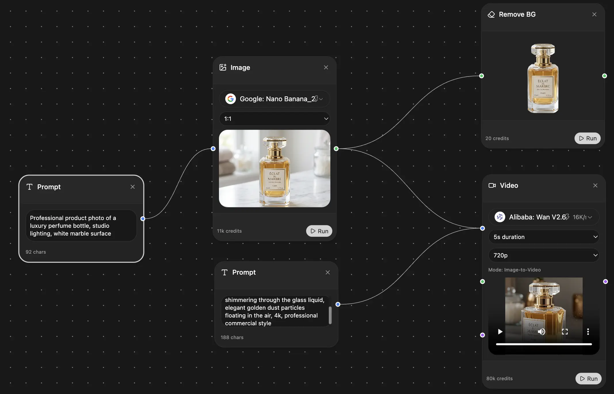
AI becomes useful in a serious way here. Not as a shortcut to skip strategy, but as a faster way to test variants, pressure-test behavior, and build a system that works across formats. On a multi-model platform like Zemith, teams can move from concept exploration to image generation to motion prompts and brand documentation in one workflow instead of bouncing between disconnected tools.
If the rules are weak, the logo turns inconsistent fast. If the rules are too rigid, the identity cannot keep up with real channels. The sweet spot is a system with enough control to stay recognizable and enough freedom to stay useful. A good starting point is this guide on .
For wider context, I also recommend this roundup of upcoming design trends for 2025. Trend reports should not dictate your identity, but they do help creative teams separate short-lived aesthetics from deeper shifts in digital behavior.
The better question is no longer, “What should our logo look like?”
It is, “What should our logo be able to do?”
Meet the Seven Faces of the Next Generation Logo
There isn’t one correct version of a next generation logo. There are several useful directions, and most strong systems combine more than one.
One reason this space is moving quickly is that many small businesses are already using AI-powered tools for logo design. That speed makes experimentation easier, especially for identity systems that need more than one locked mark.
Dynamic
A dynamic logo changes appearance based on time, context, or campaign.
Consider it stage lighting on a set. The structure stays the same, but the mood shifts. The benefit is freshness without losing familiarity.
This works well for media brands, seasonal promotions, and brands that publish often.
Generative
A generative logo uses rules or algorithms to create variations.
It’s closer to a music system than a single song. You define the instruments, tempo, and key, then let the composition change. The benefit is scale. You can create many on-brand outputs without redrawing from scratch.
Generative approaches are especially useful when a brand wants individuality across products, communities, or events.
Responsive
A responsive logo adapts to screen size, format, or placement.
Water is the best analogy here. It takes the shape of the container without becoming something else. The benefit is legibility. Your mark stays clear whether it appears on a phone header or a conference wall.
This is one of the most practical upgrades a team can make, and one of the least flashy.
Variable
A variable logo has adjustable attributes such as weight, spacing, detail level, or color intensity.
Think of a variable font, but for identity behavior. The benefit is precision. Designers and marketers can tune the mark for specific uses without inventing unauthorized alternates.
A variable system is often what saves a brand from endless “quick one-off fixes.”
Interactive
An interactive logo responds to user action, such as hover, click, touch, or sound.
It behaves more like an interface element than a stamp. The benefit is engagement. Done well, it creates a tiny branded moment that feels intentional instead of decorative.
If you want to see how static visuals can start moving in practical ways, this guide to animation workflows is useful:
Modular
A modular logo is built from parts that can rearrange or expand.
Lego is the obvious analogy, and yes, it’s still a good one. The benefit is flexibility across sub-brands, campaigns, and environments where one monolithic mark becomes restrictive.
Modular systems are great for education, events, product suites, and communities.
Data-driven
A data-driven logo reflects live or changing inputs.
It can respond to weather, location, user activity, or content categories. The benefit is relevance. The identity feels connected to the experience instead of pasted on top of it.
The strongest systems do not use all seven faces. They pick the two or three that match the brand’s actual behavior.
A common mistake is stacking every advanced idea into one logo. That usually creates a clever demo and a terrible working asset. Pick the modes your team can maintain.
Next Generation Logos in the Wild
Open a fitness app at 6 a.m., check a delivery update at lunch, then skim a news alert on the train home. A static logo can label each moment. A next generation logo can participate in it.
That difference matters in real products.
The fitness app that stopped looking generic
A fitness brand can turn its logo into a quiet part of the training experience. During onboarding, the mark can pulse gently to signal progress. In workout mode, it can tighten or accelerate to reflect intensity. On a rest screen, it can settle back down.
Used well, that behavior creates feedback, pacing, and recall. Used badly, it turns into UI noise. The trade-off is simple. Motion has to support the product flow, not compete with it.
The newsroom identity that reflects the moment
Publishing is another strong fit because editorial products already shift tone all day. A digital newsroom can keep one core symbol, then adjust motion, framing, or color behavior by section. Business can feel restrained. Culture can loosen up. Breaking news can move with more urgency and contrast.
The mark stays recognizable, but the expression matches the context readers are in. That gives the identity range without forcing the design team to invent a new badge for every vertical.
The delivery brand that makes packaging feel alive
Delivery and retail teams usually need the hardest working logo system of the bunch. The version printed on a parcel has to stay clean and cheap to reproduce. The version inside the app can carry status, motion, and micro-interactions. Social posts may only need a cropped fragment or mnemonic shape, as long as it still reads as the same brand.
That is where a system beats a single file. The logo stops acting like a sticker and starts behaving like a coordinated asset across packaging, product, and comms.
For teams exploring image-led concept development for these scenarios, this guide to GPT image generation workflows is a useful starting point:
I have found an integrated platform like Zemith becomes useful for creatives in this context. Instead of bouncing between a prompt tool, a separate image model, a motion test app, and a brand deck, teams can develop concepts across multiple models in one place and compare directions faster. The gain is not just speed. It is better judgment because the system can be tested in context earlier.
The best real-world use cases connect logo behavior to product behavior.
That is the standard. If the logo changes in a way that improves context, memory, or interaction, it earns its place. If it only shows off, it will not survive contact with an actual product team.
Create Your Own Next Gen Logo with AI
The fun starts here. Also where people get sloppy.
AI can speed up logo exploration fast, but speed is not taste. You still need constraints, judgment, and a system-first mindset. Otherwise you end up with thirty cool images and one exhausted designer.
A practical workflow matters because post-2025 AI image models can enable significantly faster design iterations compared to traditional methods, which is great only if your process can absorb that speed productively.
Step 1 Build the system before the symbol
Do not open an image model first.
Start with these questions:
- Where will this logo live most often
- What must remain recognizable in every version
- What is allowed to change
- Should it react to size, motion, input, or data
- Who will use it besides the design team
Write the answers in plain language. Not brand poetry. Not “our logo embodies synergy.” Nobody wants to animate synergy.
Good starting constraints look like this:
- Core shape: Rounded triangular loop
- Visual feeling: Precise, warm, intelligent
- Allowed motion: Slow morph, subtle pulse
- Forbidden behavior: No glitch effects, no heavy 3D chrome
- Primary use cases: App icon, website header, social avatar, video opener
If you need help prompting from that kind of brief, this collection of prompt patterns is useful:
Step 2 Generate directions, not final answers
Run broad concept explorations first. Create distinct territories.
Try prompts like:
Generative tech identity “Create a next generation logo concept for a software startup, rule-based geometric symbol, adaptive identity system, minimal vector look, scalable silhouette, blue and green palette, clean white background”
Motion-first media brand “Design a logo for a digital media platform, bold central symbol, built for animation, responsive logo system, high contrast, editorial feel, simple forms, premium modern design”
Modular community brand “Create a modular brand mark for a creative community, interlocking shapes, flexible system for sub-brands, minimal vector aesthetic, friendly but sharp, black and neutral palette”
The key is comparison. Generate very different approaches so you can evaluate behavior, not just looks.
Step 3 Stress-test every promising concept
Many AI logo workflows fall apart here. A mark looks impressive as a polished image and weak everywhere else.
Check each concept in these conditions:
- Tiny avatar
- Single color
- Dark background
- Motion intro
- UI header
- Packaging or merchandise
A concept that only works as a glossy hero image is not a logo system. It’s poster art wearing a fake mustache.
If a mark fails at favicon scale, it has not earned the right to become “next generation” anything.
Step 4 Refine with targeted edits
Once you have one or two strong territories, stop regenerating endlessly. Start editing with intention.
Refine for:
- Silhouette: Make the outer shape easier to remember.
- Contrast: Remove detail that muddies small-size performance.
- Variation rules: Decide what changes and what never changes.
- Motion logic: Define how the logo enters, loops, and rests.
- Accessibility: Make sure contrast and clarity hold up in practical use.
At this point, use image editing tools for object cleanup, background replacement, prompt analysis, and version control. That’s faster than trying to brute-force every micro-change through fresh generation.
A good checkpoint is to create this mini kit:
Later in your workflow, seeing real-time logo process examples can help tighten decision-making:
Step 5 Choose the model based on task
Different image models tend to be better for different phases.
Use one model for wide concept exploration, another for detail refinement, and another for polished presentation frames if needed. The point is not loyalty to one engine. It’s selecting the right tool for ideation, structure, and finish.
That multi-model approach is what makes AI useful for identity work. One model can be too literal. Another can over-stylize. A better workflow lets you test, compare, and keep the strongest logic from each round.
Step 6 Finish like a designer, not a prompt gambler
The final pass should look boring on the surface. That’s good.
Clean up geometry. Lock spacing. Define color logic. Export practical versions. Write usage notes. Hand off assets people can use.
A next generation logo does not become advanced because the concept art looked futuristic. It becomes advanced when it survives real-world use without constant rescue.
From Image File to Interactive Brand Asset
A polished logo image is still just a design artifact until someone ships it.
The technical handoff matters because different behaviors need different formats.
Pick the right output for the behavior
- SVG: Best for crisp scalable marks, especially when motion is minimal or CSS-driven.
- Lottie: Useful for lightweight interface animations and app-friendly motion assets.
- Canvas or WebGL: Better for generative or data-reactive visuals that need live rendering.
- Video export: Fine for social intros, not ideal for interactive product behavior.
You do not need to become a front-end engineer to make good decisions here. You do need enough vocabulary to ask the right questions.
Talk to developers in systems, not aesthetics
Instead of saying “make it feel futuristic,” give implementation direction like:
- Behavior trigger: Hover, scroll, load, click, or live data
- Fallback mode: Static SVG when motion is disabled
- Performance ceiling: Keep the effect subtle and lightweight
- Accessibility rule: Motion should not be required to understand the brand
That conversation gets much easier when your team already organizes assets properly. This guide on structured asset handling is worth bookmarking:
A strong handoff includes the file, the motion logic, the responsive rules, and the fallback state.
That is how a logo moves from “nice design” to usable brand infrastructure.
Conclusion Your Brand Identity Awaits
A next generation logo is not about making your brand look more high-tech than the next startup on LinkedIn. It’s about building an identity that can live across interfaces, motion, formats, and changing contexts without falling apart.
The static logo is not dead. It just isn’t enough on its own anymore.
If you’re rethinking your visual system, it helps to zoom out and revisit the bigger job of how to that stays coherent across every touchpoint. The logo is one part, but it’s the part people remember first.
Consistent, modern branding across platforms is associated with notable revenue increases, and the logo sits at the center of that identity. That is why this shift matters. Not because it sounds futuristic, but because it makes the brand more usable, more memorable, and more durable.
Frequently Asked Questions About Next Gen Logos
How do I keep consistency if the logo changes
Use rules, not fixed artwork alone.
Lock the recognizable parts first. That usually means the core shape, motion style, color logic, and spacing behavior. Then define which elements may adapt. A changing logo stays consistent when the system is strict, even if the output varies.
Are next generation logos bad for SEO or site performance
Not if they are implemented well.
A lightweight SVG or optimized Lottie animation can perform cleanly. Problems usually come from oversized media, unnecessary JavaScript, or using video where a simple vector animation would do the job better. Always keep a static fallback.
Can I trademark a dynamic or generative logo
It can be more complex than trademarking one fixed mark, but it is workable.
Teams often protect the core identifiable elements, or a defined family of variations, instead of every possible output. This is one place where legal review matters early. If your logo system is adaptive, document the stable traits clearly before filing.
If you’re ready to move past static brand files and build a logo system that can live inside modern products, campaigns, and content, is a smart place to start. It brings research, prompting, image generation, editing, collaboration, and workflow tools into one workspace, so you can explore next generation logo ideas without juggling a dozen tabs and subscriptions.
Explore Zemith Features
Every top AI. One subscription.
ChatGPT, Claude, Gemini, DeepSeek, Grok & 25+ more


Always on, real-time AI.
Voice + screen share · instant answers
What's the best way to learn a new language?
Immersion and spaced repetition work best. Try consuming media in your target language daily.
Voice + screen share · AI answers in real time
Image Generation
Flux, Nano Banana, Ideogram, Recraft + more

Write at the speed of thought.
AI autocomplete, rewrite & expand on command
Any document. Any format.
PDF, URL, or YouTube → chat, quiz, podcast & more
Video Creation
Veo, Kling, Grok Imagine and more

Text to Speech
Natural AI voices, 30+ languages
Code Generation
Write, debug & explain code
Chat with Documents
Upload PDFs, analyze content
Your AI, in your pocket.
Full access on iOS & Android · synced everywhere
Your infinite AI canvas.
Chat, image, video & motion tools — side by side
Save hours of work and research
Transparent, High-Value Pricing
Trusted by teams at
Free
No credit card required
- 100 credits daily
- 3 AI models to try
- Basic AI chat
Plus
- 1,000,000 credits/month
- 25+ AI models — GPT, Claude, Gemini, Grok & more
- Agent Mode with web search, computer tools and more
- Creative Studio: image generation and video generation
- Project Library: chat with document, website and youtube, podcast generation, flashcards, reports and more
- Workflow Studio and FocusOS
Professional
- Everything in Plus, and:
- 2,100,000 credits/month
- Pro-exclusive models (Claude Opus, Grok 4, Sonar Pro)
- Motion Tools & Max Mode
- First access to latest features
- Access to additional offers
What Our Users Say
Great Tool after 2 months usage
"I love the way multiple tools they integrated in one platform. Going in the right direction."
— simplyzubair
Best in Kind!
"The quality of data and sheer speed of responses is outstanding. I use this app every day."
— barefootmedicine
Simply awesome
"The credit system is fair, models are perfect, and the discord is very responsive. Quite awesome."
— MarianZ
Great for Document Analysis
"Just works. Simple to use and great for working with documents. Money well spent."
— yerch82
Great AI site with accessible LLMs
"The organization of features is better than all the other sites — even better than ChatGPT."
— sumore
Excellent Tool
"It lives up to the all-in-one claim. All the necessary functions with a well-designed, easy UI."
— AlphaLeaf
Well-rounded platform with solid LLMs
"The team clearly puts their heart and soul into this platform. Really solid extra functionality."
— SlothMachine
Best AI tool I've ever used
"Updates made almost daily, feedback is incredibly fast. Just look at the changelogs — consistency."
— reu0691