Master Concept Map Ecology For Ultimate Clarity in 2026
Tired of tangled data? Learn how concept map ecology helps you visualize complex systems and supercharge your research with practical, actionable tips.
An ecology concept map is your secret weapon for making sense of nature's beautiful, chaotic complexity. It’s a simple visual tool that connects key ideas—like producers, consumers, and nutrient cycles—with labeled lines that show how they all fit together. You’re essentially turning a jumble of facts into a clear, organized picture. Think of it as untangling a mess of holiday lights, but for science.
What Is Concept Map Ecology Anyway?

Let's be honest, trying to learn ecology can feel like trying to untangle a massive knot of fishing line in the dark. You've got food webs, biomes, population dynamics, and biogeochemical cycles all competing for your attention. If you feel a little lost in the weeds, you're definitely not alone.
This is where a concept map for ecology comes in to save the day. It's way more than a simple flowchart; think of it as a personalized GPS for navigating ecological concepts. Instead of just memorizing a list of terms, you're building a visual web that reveals the hidden connections between everything—from the smallest microbe in the dirt to global climate patterns.
It's a bit like drawing a map of your city. The key concepts ('Photosynthesis,' 'Deer,' 'Forest') are your major landmarks. The lines you draw between them, with labels like 'provides energy for' or 'is eaten by,' are the roads that show you exactly how to get from one point to another. It's the ultimate "how are we related?" for plants and animals.
Why This Visual Approach Wins
Our brains aren't really built to learn in a straight line, but that's how most textbooks are written. The problem is, nature doesn't work that way. Ecology is all about interconnected systems and feedback loops, and a concept map is designed to mirror that reality perfectly. In fact, research shows we process and remember visual information an incredible 60,000 times faster than plain text.
With a concept map, you can:
- Finally see the big picture. You can instantly trace how a single change—like a drop in a predator population—sends ripples across the entire ecosystem.
- Pinpoint what you don't know. Those blank spots on your map are a dead giveaway for your knowledge gaps. It's like a built-in diagnostic tool for your brain.
- Make learning an active sport. Instead of passively reading, you’re actively building, organizing, and connecting ideas. That's what makes the knowledge actually stick.
By using this approach, you stop just memorizing facts and start developing a real, systemic understanding. This is a crucial skill for everyone from students to professional researchers trying to model complex environmental challenges. This is one of many powerful visual thinking strategies that bring clarity to complex subjects.
So, are you ready to ditch the endless flashcards for a tool that actually shows you how the world works?
The Building Blocks: From Aristotle To AI
To really nail ecology concept mapping, we've got to take a quick trip back in time. Don't worry, there's no quiz later! Understanding how ecology even became a "thing" helps us build much richer, more meaningful maps today. Think of it like knowing a city's history before you try drawing its streets—context is everything.
The idea that nature is all connected isn't exactly new. Way back when, thinkers like Aristotle were already puzzling over how different creatures interact with their world. But it wasn't until 1866 that the field got its name. Ernst Haeckel mashed together the Greek words oikos (household) and logos (study) to coin the term ‘ecology.’ He saw it as the study of how organisms relate to their environment, a simple but powerful idea we still use.
Every one of these historical moments gave us new building blocks for our maps. The real game-changer came in 1935 when botanist Arthur Tansley gave us the word ‘ecosystem.’ He framed nature not as a random collection of things, but as a complete, interactive system of both living and non-living parts. This single idea became the central hub for almost every modern concept map in ecology.
A great concept map doesn’t just show what is; it shows how it came to be. It connects what we see today to the historical threads that shaped it.
From Historical Data To Dynamic Maps
This historical perspective is pure gold for map-making. A concept map of a forest today becomes so much more insightful when you add nodes for pre-industrial CO2 levels or biodiversity data from 100 years ago. Suddenly, you're not just mapping a forest; you're telling the story of why it looks the way it does. We know that human activity has dramatically altered over 75% of Earth's ice-free land, and our maps should show that impact.
This is where today’s tools really shine. We can blend that old-school wisdom with new technology. AI, for example, is fantastic at helping us structure all this messy, complex information. You can even use an to quickly organize historical facts into a clean structure for your map.
Tools like make pulling all this together surprisingly simple. Use the research features to grab historical climate data, let the Document Assistant pull key ecological shifts from dense scientific papers, and then build it all into a dynamic map on the Whiteboard. Instead of having 50 browser tabs open, you have one cohesive space to think. It's all about turning a pile of data points into a visual story that actually makes sense.
Mapping Your First Ecosystem Step By Step
Enough theory. The best way to understand concept maps is to build one. Let's get our hands dirty (virtually, of course) and map out a classic forest ecosystem. Don't worry about making it perfect on the first try—the goal here is just to get started and see how a complex system can quickly take shape.
First, you need a central idea. This is the anchor for your entire map.
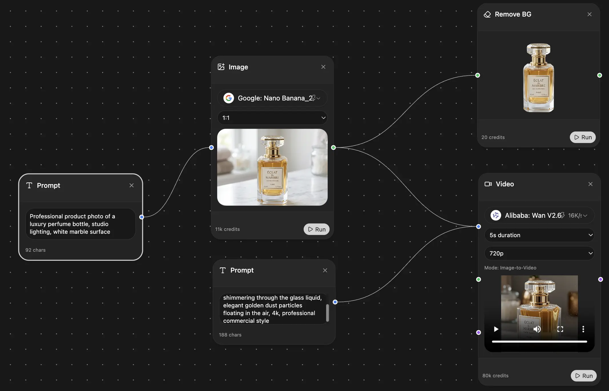
Identify Your Central Concept: Pop open a blank canvas, like Zemith's Whiteboard, and drop a node right in the middle. Let’s label it "Forest Ecosystem." Everything else will branch off from this point. Easy enough.
Brainstorm the Key Players: Now, what are the big-picture components of any forest? Just start throwing ideas onto the board. You’ve got things that create energy (Producers), things that eat other things (Consumers), and the cleanup crew (Decomposers). Add each of these as new nodes surrounding your main concept.
Get More Specific: This is where the map starts coming to life. Under 'Producers,' you can add specific examples like 'Trees' and 'Shrubs.' Under 'Consumers,' let's add 'Deer' and 'Foxes.' And for 'Decomposers,' we can add 'Fungi' and 'Bacteria.' Already, this looks less like a list and more like a community.
Weaving The Web of Life
Now for the magic part that separates a true concept map from a simple brainstorm. It's time to draw the connections and show how everything actually works together.
Start drawing lines between your nodes and add a quick "linking phrase" on each line to explain the relationship. For instance:
- Draw a line from 'Trees' to 'Deer' and label it "is eaten by."
- Connect 'Deer' to 'Foxes' and label it "provides energy for."
- Link 'Foxes' (and every other living thing, eventually) to 'Fungi' with a line labeled "is decomposed by."
As you add these relationships, you're visually explaining the flow of energy and nutrients. You're building a model of an ecosystem, a concept first formally described by Arthur Tansley way back in 1935 as the interactive system between living organisms and their non-living environment. It's cool to see how a simple map can capture such a foundational scientific idea.
Here’s a rough idea of what your first draft might look like on a digital whiteboard.
A tool like Zemith's Whiteboard makes this process a breeze. You can easily drag nodes around until the layout feels right and even color-code them—maybe green for producers and red for consumers—to make the roles instantly recognizable.
Refine and Expand Your Map
A good concept map is never really "done." Your first draft is just a starting point.
Take a step back and look for missing pieces. Do 'Trees' need anything? Absolutely. Add a new node for 'Sunlight' and connect it with the phrase "needs for photosynthesis." What about the 'Fungi'? They "release nutrients into' a new node you can label 'Soil.'
And just like that, you've gone from a simple food chain to a map that shows both energy flow and nutrient cycling. This visual diagram explains complex ecological interactions way more intuitively than a block of text ever could. If you want more strategies for organizing visual information, check out our guide on . You’re already on your way to building clearer, more powerful ecological models.
Mapping Food Webs and Nutrient Cycles (The Fun Part!)
Alright, you've gotten the hang of a basic ecosystem map. That's a great start. But now, it's time to dive into the deep end and map the truly messy, fascinating parts of ecology: the tangled webs of who eats whom and the invisible cycles that move life's essential ingredients around the planet.
This is where a concept map for ecology goes from a simple study aid to a serious analytical tool. A food chain is just a straight line, but a food web? That's more like a sprawling city map during rush hour, with connections and feedback loops going in every direction. It’s a level of complexity that’s tough to wrap your head around just by reading a textbook.
A concept map helps you see the beautiful, organized chaos. Even a basic one can clarify how an ecosystem is structured around its core functions.

This map shows how a central concept—the forest itself—supports the different groups that make the whole system tick. Visualizing it this way makes the abstract idea of an ecosystem feel much more concrete.
Mapping A Food Web With All Its Twists
When you're ready to build a more advanced food web map, you're moving beyond a simple "grass is eaten by rabbit, which is eaten by fox" diagram. You start adding concepts that reveal how the whole system behaves. What if you're trying to figure out "how do keystone species affect trophic cascades in a marine environment?" This is where a map shines.
- Apex Predators: Think of a 'Wolf' node. It's going to have a bunch of arrows pointing to it with labels like "eats," but none pointing away to another predator.
- Keystone Species: This is a game-changer. Take the 'Sea Otter.' If you remove it, the whole system can collapse. You’d show this by connecting it to 'Sea Urchins' with the phrase "controls population of," which then connects to 'Kelp Forests' with "grazes on." You can instantly see the chain reaction.
- Trophic Levels: You can use colors or spatial grouping to cluster your Producers, Primary Consumers, Secondary Consumers, and so on.
By mapping these relationships, you’re doing more than just listing a menu. You're building a visual model of the ecosystem's stability, and you can start to see where its biggest vulnerabilities lie.
A food web concept map shows you why pulling one little thread can make the whole sweater unravel. It’s the perfect tool for demonstrating the far-reaching impacts of species loss.
Visualizing The Unseen: The Nutrient Cycles
Let's be honest, nutrient cycles like the carbon or nitrogen cycle can feel abstract and, well, a little dry. But they are literally what makes life on this planet possible. A concept map is the perfect way to turn these invisible processes into a story you can actually follow.
Take the carbon cycle. Your main concepts here aren't just organisms, but also the reservoirs where carbon is stored and the processes that move it.
- Reservoirs (Nodes): Atmosphere, Oceans, Fossil Fuels, Plants, Animals, Soil.
- Processes (Linking Phrases): ‘Photosynthesis’ is the connector that moves carbon from the ‘Atmosphere’ to ‘Plants.’ ‘Respiration’ moves it from ‘Plants’ and ‘Animals’ back to the ‘Atmosphere.’ ‘Combustion’ moves it from ‘Fossil Fuels’ to the ‘Atmosphere.’
All of a sudden, you can trace the journey of a single carbon atom. More importantly, you can visually pinpoint where human activities, like an oversized 'Combustion' arrow, are creating imbalances. It’s a clarity that a list of notes just can't provide. If you want to make your diagrams even more powerful, check out some to sharpen your skills.
To help you get started on these more complex topics, here are a few "starter kits" with the essential building blocks.
Concept Map Starter Kits For Key Ecology Topics
This quick-reference guide provides the core concepts (nodes) and common linking phrases (connectors) you'll need to jumpstart your own maps for some of ecology's most important subjects.
Think of these as your foundational templates. You can build out from here, adding layers of detail and specific examples relevant to the ecosystem you're studying.
Using a flexible tool like Zemith's Whiteboard is ideal for this kind of work. You can easily drag and drop nodes, draw and redraw dozens of connections, and color-code different parts of your map, like reservoirs versus processes. It lets you build a dynamic model that reveals the hidden feedback loops that really define how our world works.
Making It Happen: Building Your Ecology Map with Zemith

A well-organized concept map, like the one you see here in Zemith, does more than just look good. It makes complex ecological relationships click into place. When you move past simple text notes, you’re not just studying—you're building a hands-on, interactive model of an ecosystem.
So, we've talked theory and even sketched out some basic maps. Now for the practical part. Let's be honest, the tools you use can be the difference between a messy page of doodles and a powerful, shareable model. This is where a platform like can help you really level up your concept mapping, letting you turn messy data into clear insights without needing a dozen different apps.
Think about it. Say you're starting a new research project on "how deforestation affects local rainfall patterns for my thesis." The sheer volume of information can feel like trying to drink from a firehose. A good workflow makes all the difference.
From Blank Page to Finished Map
Starting with a blank screen can be intimidating. But with the right tools working together, you can create a clear path forward. Zemith's features are designed to connect, turning what could be a multi-day research headache into a much smoother process. Forget the chaos of scattered notes and a browser with 50 open tabs. Here’s a better way to tackle your next concept map on ecology.
First, I usually start with the Deep Research tool to cast a wide net and gather initial information. It pulls from academic journals and real-time data, giving me a solid foundation and saving hours of manual searching.
Next, you've probably got a few dense research papers or hefty reports. Instead of grinding through them word-for-word, I just feed them to the Document Assistant. It pulls out key terms, quick summaries, and critical data points. In minutes, you have the building blocks for your map without all the grunt work.
It's like having a research assistant who’s had way too much coffee and can tear through a 50-page paper in 30 seconds. You get all the core concepts without the fluff, so you can jump straight to making connections.
Bringing Your Ideas to Life
Once you have your key concepts, it's time to brainstorm. I open up the Smart Notepad and just paste my messy, jumbled list of terms. From there, I can use the AI to help sort them into logical groups, expand on certain ideas, or even suggest relationships I might have overlooked.
Here’s the workflow I typically follow:
- Gather Intel: Use Deep Research to get a broad overview of an ecology topic.
- Extract Concepts: Feed dense papers to the Document Assistant to pull out the essential nodes for the map.
- Brainstorm & Structure: Drop those concepts into the Smart Notepad to organize my thoughts and flesh out more ideas.
- Build The Map: Move over to the Whiteboard to visually connect all the nodes, color-code relationships, and build the actual dynamic model.
- Organize Everything: Keep all the research, documents, notes, and maps tucked neatly into a single Zemith Project for easy access later.
And if you need a specific visual for your map, like an image of a 'keystone species' in a kelp forest? The AI Image Generator can whip one up for you right on the spot.
By stringing these tools together, you’re not just making a map—you're building a complete research hub. It’s an incredibly efficient way to wrangle complexity, whether you're a student cramming for an exam or a researcher modeling environmental change. If you're curious about how these kinds of tools work under the hood, our guide to using a is a great place to dig deeper.
Your Ecology Concept Map Questions Answered (The FAQ)
Jumping into a new method always brings up some questions. You've seen what ecology concept maps can do, but let's clear up a few common sticking points so you can get started with total confidence.
How Is A Concept Map Different From A Mind Map?
This is easily the most common question people ask, and it’s a great one. They look a bit alike at first glance, but they’re built for completely different jobs.
Think of it this way: a mind map is for brainstorming, and a concept map is for sense-making.
- A mind map is a simple tree. You put one idea in the middle and just branch out with related thoughts. It’s perfect for just dumping a ton of ideas onto a page without worrying about how they all fit together.
- A concept map is a web. It’s all about the relationships between multiple core ideas. The key difference is the labeled lines that create a full sentence: "Kelp Forests are grazed by Sea Urchins."
So, while a mind map is like making a quick list of places to visit in a city, a concept map is like drawing the actual city map, complete with roads, highways, and one-way streets explaining how you get from one place to another. It’s about understanding the system.
Can I Use Concept Maps For My Specific Research Topic?
One hundred percent, yes. In fact, the more niche or complex your topic, the more you'll get out of concept mapping.
It doesn’t matter if you’re a student tracking wolf populations in Yellowstone, a postdoc modeling how microplastics move through marine food webs, or a professional studying green infrastructure in cities. The method is incredibly flexible.
A good map can help you:
- Make sense of a giant pile of research papers for a literature review.
- Visually sketch out a hypothesis before designing an experiment.
- Pinpoint the exact knowledge gaps that could become your next big project.
- Communicate your complex work to people outside your field.
Seriously, there's no ecological topic too messy for a concept map. The tool is built to bring order to the chaos.
Don't ever think your topic is "too complex" for a map. The messier it is, the more you need one. The map is a tool for taming that complexity, not avoiding it.
How Detailed Should My Concept Map Be?
The real answer? As detailed as you need it to be for your specific goal. There's no secret formula for the "right" number of concepts.
If you're cramming for an exam, a simple map with 10-15 core concepts is probably all you need to lock in the main ideas. But if you’re building a map for your doctoral thesis on biochemical pathways, it could easily balloon to hundreds of nodes and connections. And that’s fine!
The best thing about concept maps—especially on a digital tool like Zemith—is that they are living documents. Start with a basic skeleton connecting the biggest ideas. You can always come back and add more detail as your understanding deepens or your research progresses. The "right" level of detail is whatever gets you to that "aha!" moment of clarity. Start simple and build from there.
Ready to stop juggling dozens of apps and start building a seamless ecosystem for your own research? Try Zemith and see how its integrated Whiteboard, Smart Notepad, and Document Assistant can turn you into a concept mapping pro. Explore all the tools at and build your first map today.
Explore Zemith Features
Every top AI. One subscription.
ChatGPT, Claude, Gemini, DeepSeek, Grok & 25+ more


Always on, real-time AI.
Voice + screen share · instant answers
What's the best way to learn a new language?
Immersion and spaced repetition work best. Try consuming media in your target language daily.
Voice + screen share · AI answers in real time
Image Generation
Flux, Nano Banana, Ideogram, Recraft + more

Write at the speed of thought.
AI autocomplete, rewrite & expand on command
Any document. Any format.
PDF, URL, or YouTube → chat, quiz, podcast & more
Video Creation
Veo, Kling, Grok Imagine and more

Text to Speech
Natural AI voices, 30+ languages
Code Generation
Write, debug & explain code
Chat with Documents
Upload PDFs, analyze content
Your AI, in your pocket.
Full access on iOS & Android · synced everywhere
Your infinite AI canvas.
Chat, image, video & motion tools — side by side
Save hours of work and research
Transparent, High-Value Pricing
Trusted by teams at
Free
No credit card required
- 100 credits daily
- 3 AI models to try
- Basic AI chat
Plus
- 1,000,000 credits/month
- 25+ AI models — GPT, Claude, Gemini, Grok & more
- Agent Mode with web search, computer tools and more
- Creative Studio: image generation and video generation
- Project Library: chat with document, website and youtube, podcast generation, flashcards, reports and more
- Workflow Studio and FocusOS
Professional
- Everything in Plus, and:
- 2,100,000 credits/month
- Pro-exclusive models (Claude Opus, Grok 4, Sonar Pro)
- Motion Tools & Max Mode
- First access to latest features
- Access to additional offers
What Our Users Say
Great Tool after 2 months usage
"I love the way multiple tools they integrated in one platform. Going in the right direction."
— simplyzubair
Best in Kind!
"The quality of data and sheer speed of responses is outstanding. I use this app every day."
— barefootmedicine
Simply awesome
"The credit system is fair, models are perfect, and the discord is very responsive. Quite awesome."
— MarianZ
Great for Document Analysis
"Just works. Simple to use and great for working with documents. Money well spent."
— yerch82
Great AI site with accessible LLMs
"The organization of features is better than all the other sites — even better than ChatGPT."
— sumore
Excellent Tool
"It lives up to the all-in-one claim. All the necessary functions with a well-designed, easy UI."
— AlphaLeaf
Well-rounded platform with solid LLMs
"The team clearly puts their heart and soul into this platform. Really solid extra functionality."
— SlothMachine
Best AI tool I've ever used
"Updates made almost daily, feedback is incredibly fast. Just look at the changelogs — consistency."
— reu0691