Make Economics Graphs: From Excel to AI-Powered Plots
Learn how to make economics graphs like a pro. This guide covers supply/demand, time series, and more in Excel, Python, and new AI tools like Zemith.com.
You're probably here because the graph in your head looks clean, but the graph on your screen looks like it got into a fight with Excel and lost.
That happens to almost everyone who tries to make economics graphs in a hurry. The idea is simple enough. Draw demand sloping down, supply sloping up, mark equilibrium, move on with your life. Then reality kicks in. Axes feel backward, labels drift, curves look jagged, the shaded surplus area turns into abstract art, and your professor, client, or manager somehow notices the one thing you hoped they wouldn't.
The annoying part is that economics graphs are supposed to clarify thinking. A good one can make a policy story, market shift, or welfare change obvious in seconds. A bad one makes even correct analysis feel shaky. The difference usually isn't intelligence. It's tool choice, setup order, and knowing when “good enough” is actually good enough.
Why Making Good Econ Graphs Is Harder Than It Looks
At 2 AM, a supply and demand graph can feel weirdly personal.
You know the theory. You know what a price ceiling does. You know where the shortage should appear. But once you try to draw it cleanly, the tiny details start mattering. Is your vertical line hitting the exact quantity? Did you label the new equilibrium clearly enough? Why does your “curve” look like a broken coat hanger?

The conventions are old for a reason
Economics graphs have their own grammar. Economists have standardized graph conventions since the late 19th century, plotting price on the vertical y-axis and quantity on the horizontal x-axis. Alfred Marshall's 1890 textbook helped lock that in, and by 2023 this convention underpinned over 80% of visual representations in peer-reviewed economics journals, according to .
That setup can feel backward if you learned graphing in a general math or science class. In most of those settings, the independent variable sits on the x-axis and everyone goes home happy. Economics chose a different visual habit, and now everyone in the field expects it.
If you break that convention, readers have to pause and decode your chart before they can understand your point. That's a bad trade.
Practical rule: If your graph makes the reader stop to figure out the axes, the graph is already working too hard.
Econ graphs are simple, until they aren't
A basic market diagram is easy to sketch by hand. A useful one is more demanding. You need consistent axes, readable labels, intentional spacing, and enough visual contrast that the key movement stands out. That's true whether you're drawing a tax wedge, a production possibility frontier, or a Lorenz curve.
The same challenge shows up outside the classroom. If you want a feel for how financial institutions turn dense reporting into something decision-makers can read, this piece on is worth a look. Different domain, same lesson. Raw data does not become a story on its own.
The graph is doing rhetorical work
A clean economics graph doesn't just display a result. It argues for an interpretation.
That's why two charts with the same underlying idea can land very differently. One says, “I thought about what matters here.” The other says, “Please be generous during grading.” Many creators don't need a fancier idea. They need a better workflow.
- Conventions matter because readers scan before they study.
- Shape matters because economics relies on direction, intersection, and area.
- Design matters because clutter hides the mechanism.
- Tool choice matters because not every graph deserves a full coding project.
That last point saves a lot of time.
Choosing Your Graphing Weapon of Choice
The best graphing tool is the one that matches the job. Not the one with the coolest logo. Not the one your most technical friend won't shut up about. The one that gets you to a clear, credible graph with the least friction.

Digital graphing tools have taken over modern economics work. The use of digital tools for economics graphs has surged since the 2010s. By 2025, 95% of Fortune 500 firms integrated economic graphing software for forecasting, and EconGraphs.org is used by over 50,000 educators annually across 100+ universities, according to .
That doesn't mean you should use the same stack for every task.
A quick comparison that actually helps
When spreadsheets are the right answer
If you need a graph in the next hour, use Excel or Google Sheets. That's not laziness. That's triage.
Spreadsheets are ideal when the point is straightforward and the audience is forgiving about aesthetics. A clean line chart for inflation over time, a basic supply and demand diagram for class, or a presentation slide for a meeting. Done.
Use a spreadsheet when:
- You need speed: You can get from data to chart without opening a terminal.
- You expect last-minute edits: Spreadsheets are easy for non-technical collaborators.
- The graph is disposable: Not every chart deserves a lovingly crafted script.
When code earns its keep
Python becomes worth it when you care about consistency, precision, or repeatability. If you'll remake the same chart with updated data, need custom styling, or want confidence that intersections and curves are mathematically placed instead of eyeballed, code is the better bet.
Open-source tools such as Gnuplot and Matplotlib sit in that advanced tier for a reason. They reward you once the graph matters enough.
If you're doing the same chart twice, scripting it usually beats redrawing it.
AI is useful, but only if it fits your workflow
Many people get fooled at this stage. AI can draft ideas fast, but speed isn't enough if the result is a static image you can't tweak. For research-heavy work, the useful question isn't “Can AI draw a graph?” It's “Can AI help me move from notes, data, and concepts to something editable?”
If you're sorting through tools broadly, the roundup on is useful because graph-making is rarely a standalone task. Usually you're also summarizing sources, cleaning notes, and figuring out what the graph should say in the first place.
The shortest honest decision rule
Use this and save yourself some drama:
- Spreadsheet: when “clear enough by lunch” is the goal
- Python: when precision and reuse matter
- AI-assisted workflow: when you're still shaping the question and don't want to bounce across five apps
- Design software: when the chart is final and nobody will be updating the data tomorrow
If you pick the wrong tool, even a simple graph becomes tedious. If you pick the right one, the work feels suspiciously easy.
The Bread and Butter Graphs in a Spreadsheet
Most economics graphs people need every week can be built in a spreadsheet. Not every week in an ideal universe. In this one.
That includes the classics. Supply and demand, simple policy shifts, time-series plots for inflation or GDP, and quick comparisons across categories. If you know a few setup tricks, Excel and Google Sheets do more than people give them credit for.

Build the table before you build the chart
Most ugly spreadsheet charts start with ugly source tables.
For a basic supply and demand graph, structure your data so each series has a clean set of quantity values and corresponding price values. Keep your quantities in one column and your prices for each curve in separate columns. Then use an XY scatter plot with straight lines, not a generic line chart.
That matters because a line chart treats the x-axis like categories. An XY scatter plot treats it like actual numeric space. Economics diagrams need numeric space.
A simple setup looks like this:
Keep the table minimal. You don't need many points for straight lines. You just need them to be intentional.
The fast workflow for a clean market graph
Use this order and you'll avoid most spreadsheet chaos:
Enter axis-ready data Put quantity values in ascending order. Make sure each curve has matching rows.
Insert an XY scatter chart Choose the option with straight lines. This is the “don't accidentally sabotage yourself” step.
Rename each series “Series 1” is not helping anyone. Label curves as Demand, Supply, Demand after tax, or whatever the chart shows.
Set axis bounds manually Don't let Excel guess if the visual story depends on equilibrium placement.
Add equilibrium markers Plot the equilibrium as its own point series, then label it with text boxes or data labels.
Use shape overlays sparingly Vertical and horizontal equilibrium guides can be added with lines, but don't turn the chart into a geometry worksheet.
If you want a broader primer on what makes a chart readable in the first place, this guide on gives useful context beyond economics.
Quick check: If the reader can't identify the market, the curves, and the equilibrium in about three seconds, simplify the chart.
Shading surplus without losing your mind
This is the part where spreadsheets become mildly rude.
Consumer surplus and producer surplus shading is possible in Excel, but it's fiddly. For simple classwork, the fastest route is often to add translucent shapes manually after the chart is built. That's acceptable when the goal is explanation, not a journal figure.
For more exact work:
- Use helper series to define the region boundaries.
- Keep fills light so the curves remain visible.
- Avoid too many colors because surplus, tax revenue, deadweight loss, and equilibrium all competing for attention turns into chart soup.
A lot of students overdecorate here. Don't. One accent color and one neutral fill usually works better than a rainbow.
Here's a visual walkthrough if you want to see spreadsheet-style chart building in action:
Don't sleep on time series
Spreadsheets are especially good for econ charts that track something over time. If you're plotting inflation, output, unemployment, or any simple trend line, Excel and Sheets are often the right answer even for professional work.
A few habits make these charts cleaner:
- Label the units clearly: Percent, index, dollars, or quantity.
- Avoid chart junk: Gridlines should help, not dominate.
- Use direct labels when possible: Legends force eye travel.
- Smooth only when justified: Don't iron out volatility just because the line looks prettier.
For everyday graphing, the spreadsheet is still the workhorse. It's not glamorous. Neither is a stapler. But both keep offices alive.
Leveling Up with Python for Custom Plots
Spreadsheets are great until you want exact control. Then they start negotiating with you.
Python doesn't negotiate. It just asks whether you know what you're doing. That sounds harsh, but it's also why so many researchers stick with it. Once you've built a chart in code, you can rerun it, restyle it, and update it without dragging boxes around the screen like you're playing a very boring video game.
For advanced graphs, open-source tools like Gnuplot and Matplotlib offer stronger customization. A reliable professional workflow follows this sequence: axis parameterization, constraint line insertion, curved element generation using functions, and labeling, as described in .
A copy-pasteable example
Here's a simple Python script for a stylized Lorenz curve using Matplotlib:
Cumulative population share
x = np.linspace(0, 1, 200)
Stylized Lorenz curve
y = x**2
plt.figure(figsize=(7, 5)) plt.plot(x, y, label='Lorenz Curve', linewidth=2) plt.plot(x, x, linestyle='--', label='Line of Equality', linewidth=1.5)
plt.title('Lorenz Curve') plt.xlabel('Cumulative Share of Population') plt.ylabel('Cumulative Share of Income') plt.xlim(0, 1) plt.ylim(0, 1) plt.grid(True, alpha=0.3) plt.legend() plt.tight_layout() plt.show()
This does a few things right that spreadsheet users often skip:
- Axes are defined intentionally
- Functions generate smooth curves
- Labels are part of the plot, not floating separately
- The output is reproducible
You can adapt the same logic for utility curves, production possibility frontiers, or a custom demand schedule.
Why the order matters
A lot of frustration in Python comes from skipping the setup logic.
If you start by drawing curves before you've thought through axis limits, labels, and scale, you end up rewriting half the script. That's why the sequence above matters. First define the coordinate system. Then add straight-line constraints or reference lines. Then generate curves. Then label and polish.
Start with the frame, not the fancy part. The curve is not the graph. The graph is the whole communication package.
Where Python is worth the hassle
Python pays off when:
If you're working across policy, economics, and adjacent social science fields, the broader tooling advice in this is useful too. Different discipline, same practical problem. Good analysis often depends on choosing boringly effective tools.
The hidden win is exploratory work
Python isn't just for final charts. It's excellent for figuring out what the chart should be.
If you're comparing series, checking distributions, or testing a few possible visual stories before committing to one, the right analysis workflow matters as much as the final plot. This overview of is a good reminder that graphing is often downstream from better questioning.
The punchline is simple. Use Python when the graph needs to be exact, reusable, or unusually customized. Don't use it just to feel high-level. Nobody has ever been rescued by a needlessly ornate notebook.
The AI-Powered Future of Economic Storytelling
AI can already generate an economics graph. That's the good news.
The bad news is that many tools stop there. They give you a static image, maybe a decent-looking one, and then leave you stranded when you want to change the tax rate, shift demand again, or explain the result to someone else. For economics work, that's a real limitation because graphs are rarely one-and-done. They evolve as the question evolves.

The gap is real
As of late 2025, there's a major gap in AI tools that create dynamic, editable economics graphs. Google Trends shows a 240% surge in searches for “AI economics graph maker” since May 2025, yet users complain that current tools often produce static, uneditable outputs, according to .
That tracks with what people need. Economics isn't just image generation. It's scenario modeling.
You ask one question, then another. What if the subsidy is larger? What if supply becomes less responsive? What if inflation shifts expectations? A static chart can't help much after the first answer.
What useful AI graphing should look like
The better model is an AI workflow that helps with the whole chain:
- Interpret the prompt clearly
- Generate an editable graph structure
- Allow iterative changes without starting over
- Keep text, data, and visuals in the same workspace
- Support explanation, not just illustration
That last part gets overlooked. A graph is often there to support a memo, report, class explanation, or policy discussion. If the graph sits in one tool and your reasoning sits in another, you waste time shuttling between tabs and losing context.
A broader review like is helpful here because it highlights the difference between AI that decorates work and AI that supports analysis. Economics needs the second kind.
Why editability matters more than novelty
A flashy generated chart is fun for about twelve seconds.
An editable chart is useful. If you can move from “show me a supply shift” to “now annotate the shortage area” to “rewrite this explanation for undergrads” inside one workflow, AI stops being a toy and starts becoming part of actual economic storytelling.
What matters most: the best AI graph tool isn't the one that produces the prettiest first draft. It's the one that makes the fifth revision painless.
That same logic applies to written output. Graphs usually end up inside documents, slide decks, research notes, or client briefings. If you're also turning visual insights into narrative, tools built for an fit more naturally than isolated image generators.
The future is not one-click magic
It's tempting to want “type one sentence, receive perfect graph.” Real work isn't that tidy.
The stronger use of AI is collaborative and iterative. Prompt a graph. Adjust assumptions. Reword labels. Pull notes from source material. Compare scenarios. Export when you're done. That's closer to how economists, analysts, and students think.
The best part is not replacing judgment. It's shortening the distance between the idea in your head and the graph you can use.
Pro Tips for Graphs That Don't Get You Laughed Out of a Seminar
A graph can be analytically correct and still make you look sloppy. Seminar rooms are brutal that way.
The fixes are not glamorous. They are mostly small decisions made on purpose. But those small decisions are what separate “useful figure” from “why is this line neon green and unlabeled?”
Label like you respect the reader
Titles should say what the graph shows, not what software named the file. “Chart 1” is a cry for help.
Use labels that answer basic questions immediately:
- What variables are shown
- What units apply
- Which line is which
- What event or policy change matters
If a legend can be replaced with direct labels near the lines, do that. Your reader's eyes will thank you.
Use styling to guide attention
Most economics graphs need visual hierarchy, not visual excitement.
Try this:
Color should clarify structure. It should not look like your chart was sponsored by a pack of highlighters.
Your graph has one job. Point the reader to the economic mechanism, not to your formatting enthusiasm.
Export for the place it will live
A slide deck, a PDF report, and a printed handout do not need the same export choices. Advanced practitioners often use hybrid workflows such as exporting Excel data into Gnuplot or Matplotlib scripts, which reduces manual plotting errors by 85%. The same source notes that integrating document parsing, code generation, and collaborative whiteboarding can cut iteration cycles from 4-6 rounds to 1-2, according to .
That matters because graphing mistakes often creep in during handoff. You tweak values in one tool, redraw in another, then fix labels in a third. Eventually something drifts.
A few habits help:
- Export vector formats when possible: Better for papers and resizing.
- Keep the source file: Future-you will need it.
- Match font sizes to the final medium: Tiny labels on slides are an act of aggression.
- Lock in your data source notes: Don't rely on memory.
If you want a broader checklist for what clean chart communication looks like, this guide to is worth bookmarking.
The polished graph is usually the less complicated one
People often assume a more advanced graph must include more detail. Usually the opposite is true. The better graph removes everything that doesn't earn its place.
That means cleaner labels, fewer colors, more intentional spacing, and a sane workflow from data to final export. If you can get there with a spreadsheet, great. If not, use code. If AI helps reduce friction, even better. Just don't confuse tool complexity with insight.
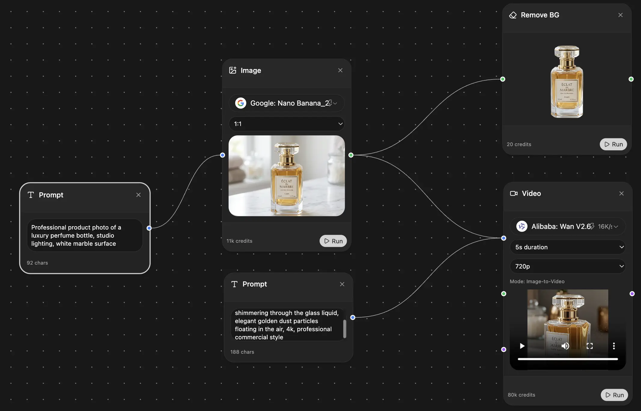
If you want one place to research, draft, refine, and turn messy economic ideas into cleaner outputs, is worth trying. It pulls together AI research, writing, coding, and collaborative workflows in one workspace, which is a lot nicer than juggling tabs while your graph refuses to behave.
**Explore Zemith Features
Every top AI. One subscription.
ChatGPT, Claude, Gemini, DeepSeek, Grok & 25+ more


Always on, real-time AI.
Voice + screen share · instant answers
What's the best way to learn a new language?
Immersion and spaced repetition work best. Try consuming media in your target language daily.
Voice + screen share · AI answers in real time
Image Generation
Flux, Nano Banana, Ideogram, Recraft + more

Write at the speed of thought.
AI autocomplete, rewrite & expand on command
Any document. Any format.
PDF, URL, or YouTube → chat, quiz, podcast & more
Video Creation
Veo, Kling, Grok Imagine and more

Text to Speech
Natural AI voices, 30+ languages
Code Generation
Write, debug & explain code
Chat with Documents
Upload PDFs, analyze content
Your AI, in your pocket.
Full access on iOS & Android · synced everywhere
Your infinite AI canvas.
Chat, image, video & motion tools — side by side
Save hours of work and research
Transparent, High-Value Pricing
Trusted by teams at
Free
No credit card required
- 100 credits daily
- 3 AI models to try
- Basic AI chat
Plus
- 1,000,000 credits/month
- 25+ AI models — GPT, Claude, Gemini, Grok & more
- Agent Mode with web search, computer tools and more
- Creative Studio: image generation and video generation
- Project Library: chat with document, website and youtube, podcast generation, flashcards, reports and more
- Workflow Studio and FocusOS
Professional
- Everything in Plus, and:
- 2,100,000 credits/month
- Pro-exclusive models (Claude Opus, Grok 4, Sonar Pro)
- Motion Tools & Max Mode
- First access to latest features
- Access to additional offers
What Our Users Say
Great Tool after 2 months usage
"I love the way multiple tools they integrated in one platform. Going in the right direction."
— simplyzubair
Best in Kind!
"The quality of data and sheer speed of responses is outstanding. I use this app every day."
— barefootmedicine
Simply awesome
"The credit system is fair, models are perfect, and the discord is very responsive. Quite awesome."
— MarianZ
Great for Document Analysis
"Just works. Simple to use and great for working with documents. Money well spent."
— yerch82
Great AI site with accessible LLMs
"The organization of features is better than all the other sites — even better than ChatGPT."
— sumore
Excellent Tool
"It lives up to the all-in-one claim. All the necessary functions with a well-designed, easy UI."
— AlphaLeaf
Well-rounded platform with solid LLMs
"The team clearly puts their heart and soul into this platform. Really solid extra functionality."
— SlothMachine
Best AI tool I've ever used
"Updates made almost daily, feedback is incredibly fast. Just look at the changelogs — consistency."
— reu0691