Black Metal Logo Creator Your AI Design Guide
Use an AI black metal logo creator to design authentic, kvlt logos. Our guide shows you how to prompt, refine, and vectorize your design with tools like Zemith.
You’ve got the riffs. You’ve got the corpse paint mood board. You’ve got a band name that looks like it was unearthed from a frozen crypt. Then you open a blank canvas and realize your “logo” currently looks like a haunted word processor accident.
That’s the bottleneck for a lot of bands, solo projects, and designers trying to build a convincing extreme metal identity. A proper black metal logo isn’t just spiky text. It’s typography, symbolism, symmetry, texture, and restraint. Too clean, and it looks like a clothing startup. Too chaotic, and it turns into abstract shrubbery.
The good news is that a modern black metal logo creator workflow no longer means choosing between two bad options: paying for fully custom work you may not be ready to commission, or using a bargain-bin generator that spits out “evil” clip art. AI image tools have changed the sketching phase dramatically. The rise of digital and AI-powered black metal logo creators since the mid-2010s has reduced creation time from days to seconds and can speed iteration by up to 5x, serving a market of 5,000+ active metal bands needing logos annually, as described in .
Summoning a Killer Logo From the Digital Abyss
If you’re here, you’re probably in one of three situations.
You’re in a band and need something better than a default gothic font. You’re a designer who understands layout but wants the old-school black metal feel without faking it. Or you’re doing visuals for a one-person project and don’t want to bounce between five tools just to get one usable concept.
The biggest trap is assuming AI should replace design judgment. It shouldn’t. AI is best at giving you raw matter. Branch-like structures. Decay textures. Symmetrical forms. Weird accidents that would take forever to draw from scratch. The human part is deciding what deserves to survive.
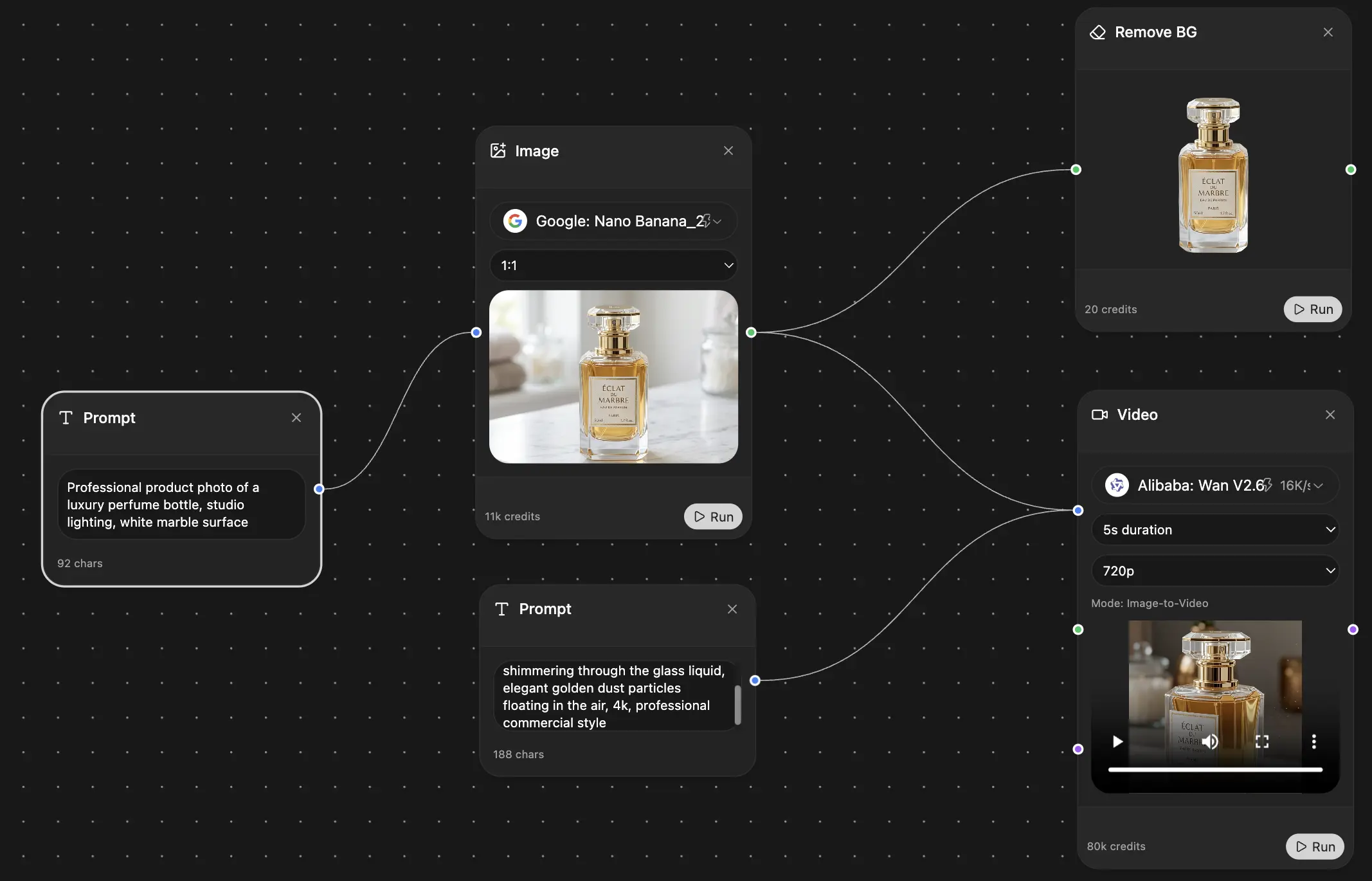
A lot of people also overcomplicate the tooling. They generate in one app, remove the background in another, ask a chatbot for prompt help in a third, then lose track of versions in a folder named “final_final_REALfinal.” That’s how perfectly good ideas die. A consolidated workflow matters, especially if you’re using AI for concepting and cleanup together. If you want to get your head around that side of image generation, this guide on is a useful reference.
What works and what doesn't
Here’s the practical split.
Practical rule: Let AI produce possibilities. Don’t let it make final decisions.
That's the key insight. Use new-school tools to get to an old-school aesthetic faster, then do the fussy craft work yourself. Think of it as inviting a demon to rough out thumbnails, not to sign the album sleeve.
Forging the Concept Before the Code
The strongest logos start before you type a prompt. If you skip this part, the machine will happily generate something “metal-looking” and spiritually empty.
Black metal design has a visual lineage. Christophe Szpajdel has designed over 10,000 logos and helped define the genre’s look through hyper-legible yet illegible gothic calligraphy and symmetrical structures tied to forest-like forms, as summarized in his . That history matters because it explains why certain motifs feel right and others feel like Halloween party decorations.
Build a tiny design brief
You don’t need a formal agency document. You need one page of clarity.
Write down:
- Band name: The exact spelling, capitalization, and any symbols
- Core themes: Pick 3 to 5 words that describe the project
- Sonic character: Raw, atmospheric, symphonic, dissonant, depressive, pagan, avant-garde
- Visual references: Nature, ruins, bones, frost, candles, roots, runes, cathedral tracery
- Use cases: Streaming profile, shirt print, back patch, poster, cassette J-card
If you’re designing for someone else, ask one blunt question: “Should this logo feel like a weapon, a forest, a shrine, or a wound?” You’ll get a better answer than “make it dark.”
A good concept process also mirrors general product design logic. If you need a refresher on defining intent before output, this piece on the is worth a look.
Match the logo to the subgenre
Beginners usually go off the rails. They treat black metal as one visual bucket. It isn’t.
A few broad patterns help:
- Atmospheric black metal often benefits from taller forms, airier spacing, and branch or mist-like extensions.
- Raw black metal can carry harsher distortion, scratchier line work, and less polished symmetry.
- Symphonic black metal usually tolerates more structure, ceremonial balance, and heraldic cues.
- Blackened death metal can support heavier mass and denser negative space.
You’re not following a law. You’re choosing a dialect.
If your music sounds like moonlit ruins, don’t give it a logo that looks like a zombie energy drink.
Gather references that aren’t just other logos
Looking only at other band marks creates derivative sludge. Pull from adjacent visual sources instead.
Try collecting references from:
- Tree roots and winter branches for organic structure
- Medieval manuscripts for letter rhythm
- Stone carvings and grave etchings for edge behavior
- Old album covers for mood, not direct copying
- Architectural silhouettes for symmetry ideas
The point is to give your prompts better ingredients later. AI gets more interesting when you feed it imagery with form, not just genre labels.
Wielding AI Your Black Metal Logo Creator
Once the concept is clear, AI becomes useful. Not magical. Useful.
The best way to treat a black metal logo creator prompt is like a recipe with strict ingredients. If you write “make me a black metal logo,” you’ll get a lot of ornamental mush. If you specify structure, texture, and composition, the models start giving you forms you can refine.
AI tools are useful here because they accelerate the brainstorming-to-prototype phase. Designers use structured prompts such as “Symmetrical black metal band logo, inspired by frost-covered branches and ancient ruins, dripping ink style, black and white” to generate rough compositions quickly, then refine them manually, as explained in this guide on .
Use a prompt formula that controls the chaos
Start with this formula:
[Style] + [Band name or pseudo text] + [Material or motif] + [Composition] + [Background] + [What to avoid]
A few working examples:
- Raw black metal logo, band name VASTR, made of thorny roots and frost cracks, mirrored symmetry, centered, black and white, plain white background, avoid readable standard font
- Atmospheric black metal emblem for ORMRUNE, thin branch lettering, ancient ruin texture, tall vertical composition, monochrome, avoid cartoon effects
- Symphonic black metal logo for NOCTIS AETERNA, ornate gothic strokes, ceremonial symmetry, candle soot texture, white background, avoid modern minimalism
The “avoid” language matters. It keeps the model away from shiny fantasy game UI nonsense.
If you want more raw material for prompt construction, this collection of is a practical place to steal structure from.
Generate ugly on purpose
Your first batch should not aim for perfection. It should aim for range.
Run variations that change only one thing at a time:
- One pass for branch-like forms
- One pass for dripping ink
- One pass for sharper rune-inspired strokes
- One pass for denser central symmetry
- One pass for looser, hand-drawn decay
That’s how you isolate useful traits. One image may have terrible lettering but excellent outer silhouette. Another might have one beautiful “A” and nothing else. That still counts as a win.
Model choice matters more than people admit
Some image models are better at tiny filigree and some are better at broader style interpretation. If you can compare multiple outputs side by side, do it. The point isn’t loyalty to one engine. The point is stealing the best visual idea from each.
For broader experimentation beyond logo-specific prompts, an can also be handy when you want to test mood references, textures, or atmospheric source imagery before tightening everything into a final monochrome mark.
Don’t ask for a final logo first. Ask for bones, texture, and shape language. Finality comes later.
A quick sanity check table
Use the table like a live mixing desk. Push one slider up, pull another down.
Refining Your Creation With Digital Witchcraft
This is the part people either skip or rush, and it’s the difference between “cool AI image” and “usable logo.”
You should assume the generation phase gave you fragments, not a finish. That’s normal. One output has the right outer silhouette. Another has a great central knot. A third has one letter that somehow looks like it crawled out of a Norwegian winter and deserves to live.
Purify the silhouette
Start by ignoring detail. Zoom out and ask a blunt question. Does the mark have a strong shape from a distance?
A black metal logo still needs an identifiable mass. If the outer contour is weak, no amount of texture will save it. I usually test this by shrinking the image until it’s obnoxiously small. If it becomes gray fuzz, the structure isn’t there yet.
Do these edits first:
- Crop aggressively: Remove empty area around the mark
- Boost contrast: Get closer to pure black on pure white
- Reduce accidental noise: Keep intentional spikes, remove random specks
- Check the center: Most bad AI logos collapse in the middle
For cleanup tasks like extraction, a dedicated guide to is useful if your generations came back with dirty paper textures, cloudy backdrops, or random fog you never asked for.
Composite the best parts
In this phase, design starts feeling like necromancy.
Take the strongest pieces from multiple generations and combine them manually. Use layers. Mask out weak areas. Flip one side only if it improves balance. Redraw broken strokes with a brush if the AI almost nailed a letter but wandered off into cursed spaghetti.
What usually works:
Field note: If you can’t explain why a spike exists, delete it.
That sounds harsh, but black metal logos are often overloaded by people trying to prove they own the thorn brush. Restraint is more sinister than clutter.
A useful visual demo sits below. Watch for how rough forms become cleaner, more intentional marks once someone starts making decisions instead of accepting every happy accident.
Fix the uncanny bits
AI has a habit of generating almost-letters. They look convincing until your eye lands on them and realizes one character is made of melted antlers and regret.
At this stage, manually correct:
- Broken counters inside letters that should stay open
- Uneven line weight that makes one side feel accidental
- Artifacts near intersections and mirrored seams
- Tangents where spikes touch in awkward ways
- Name accuracy if the model garbled the lettering
If you only remember one thing from this section, remember this: editing is authorship. The machine gave you draft matter. The decisions you make now are what turn it into identity.
Achieving Immortality By Vectorizing Your Logo
The logo looks great on screen. That doesn’t mean it’s production-ready.
Most AI-generated artwork is raster-based. It’s made of pixels. Pixels are fine for mockups, references, and social posts. They are not fine for serious logo deployment across merch, print, banners, and manufacturing.
Professional logo creation requires converting final artwork into vector format so it can scale infinitely without quality loss for printing and merchandise. This also solves the common problem of logos made in raster format that fall apart when enlarged, as outlined in this article on .
Why raster fails in the real world
The moment you move from concept to object, technical flaws show up.
A raster logo might look fine on a phone screen. Then someone wants it on a shirt back, a woven patch, a stage scrim, or a sticker. Suddenly every fuzzy edge and muddy transition becomes visible. Printers need cleaner information than “trust me, it looked sharp on my laptop.”
If you’ve ever looked at examples of iconic metal band logos, like Iron Maiden's Eddie, onto vinyl decals in physical form, this makes the point well. Hard-edged production work depends on artwork that holds shape cleanly at different sizes and materials.
Two vector paths that make sense
You have two practical options.
Auto-vectorize first.
Use a tool such as Vectorizer.ai to convert a high-contrast PNG into paths. This is fast and often good enough for a first pass, especially if your logo has clean black-white separation.
Manual tracing for control.
Bring the raster into Adobe Illustrator and redraw it using the Pen tool or a hybrid trace-and-cleanup process. This takes longer, but it gives you better control over sharp joins, mirrored structure, and negative space.
A strong workflow usually looks like this:
- Export a clean black-and-white PNG
- Run an automated vector trace
- Inspect problem areas manually
- Simplify messy path clusters
- Test small and large scale versions
For broader identity work, this guide to is useful because it frames logo files as systems, not just pictures.
A logo isn’t finished when it looks good. It’s finished when it reproduces well.
What to check before calling it done
Use this quick checklist:
- Small size test: Can you still recognize the logo when reduced?
- One-color test: Does it work in pure black with no gray support?
- Path cleanup: Are there absurd numbers of anchor points?
- Merch test: Would this survive on fabric, stickers, and screen print?
- Negative space test: Are key counters and gaps still open?
That final step is not glamorous, but it’s what separates a cool experiment from a professional asset.
Tips for Authenticity and Avoiding AI Cheese
A lot of AI-generated metal logos fail for the same reason. They understand the costume but not the culture.
Current generators often lack guidance on genre-specific design principles beyond surface aesthetics, which is why they so often drift into generic output, as noted in this breakdown of . That’s why manual refinement isn’t optional. It’s where taste shows up.
The dead giveaways
If you want your black metal logo creator workflow to produce something convincing, watch for these red flags:
- Perfect symmetry everywhere: Real black metal marks often feel balanced, not machine-sterile
- Overloaded ornament: Too many drips, horns, spikes, and roots cancel each other out
- Unreadable in the wrong way: Stylized illegibility works. Total mush doesn’t
- Generic occult props: Random pentagrams don’t equal atmosphere
- No relation to the music: The logo says “frostbitten ritual,” the songs say “garage punk with blast beats”
The fixes that actually help
The best finishing moves are subtle.
Nudge one side off balance. Extend a single thorn. Shorten a branch that’s doing too much. Redraw one weak letter by hand. Tighten spacing so the word feels intentional. If everything is equally dramatic, nothing is dramatic.
Also, check the boring adult stuff. Licensing and commercial usage matter if you plan to print merch or use the logo publicly. Read the terms for whatever tools you use. Dark art still needs paperwork. Very un-metal, I know.
The human touch isn’t decoration. It’s the part that proves the logo belongs to a band, not a prompt box.
The sweet spot is simple. Use AI for speed, use design judgment for meaning, and use vector cleanup for longevity.
If you want one workspace for brainstorming prompts, generating concepts across multiple models, cleaning up backgrounds, refining imagery, and keeping your creative mess organized without hopping between subscriptions, is worth a look. It fits the hybrid workflow well, especially when you’re juggling concept development and production-ready polish in the same project.
探索 Zemith 功能
所有顶级AI。一个订阅。
ChatGPT、Claude、Gemini、DeepSeek、Grok 及25+模型


始终在线,实时AI。
语音 + 屏幕共享 · 即时回答
学习一门新语言的最佳方式是什么?
沉浸式学习和间隔重复效果最好。尝试每天消费目标语言的媒体内容。
语音 + 屏幕共享 · AI 实时回答
图像生成
Flux、Nano Banana、Ideogram、Recraft + 更多

以思维的速度书写。
AI自动补全、改写和按命令扩展
任何文档。任何格式。
PDF、URL或YouTube → 聊天、测验、播客等
视频创作
Veo、Kling、MiniMax、Sora + 更多

文字转语音
自然AI语音,30+语言
代码生成
编写、调试和解释代码
与文档对话
上传PDF,分析内容
口袋里的AI。
iOS和Android完整访问 · 随处同步
你的无限AI画布。
聊天、图像、视频和动态工具 — 并排展示
节省数小时的工作和研究时间
简单、经济实惠的定价
受信赖的企业团队
免费
无需信用卡
- 每日100积分
- 3个AI模型试用
- 基础AI聊天
增强版
- 1,000,000积分/月
- 25+个AI模型 — GPT、Claude、Gemini、Grok等
- Agent Mode:网页搜索、计算机工具等
- Creative Studio:图像生成和视频生成
- Project Library:与文档、网站和YouTube对话,播客生成、闪卡、报告等
- Workflow Studio和FocusOS
专业版
- 包含增强版所有功能,以及:
- 2,100,000积分/月
- Pro专属模型(Claude Opus、Grok 4、Sonar Pro)
- Motion Tools和Max Mode
- 优先使用最新功能
- 访问额外优惠
用户评价
Great Tool after 2 months usage
"I love the way multiple tools they integrated in one platform. Going in the right direction."
— simplyzubair
Best in Kind!
"The quality of data and sheer speed of responses is outstanding. I use this app every day."
— barefootmedicine
Simply awesome
"The credit system is fair, models are perfect, and the discord is very responsive. Quite awesome."
— MarianZ
Great for Document Analysis
"Just works. Simple to use and great for working with documents. Money well spent."
— yerch82
Great AI site with accessible LLMs
"The organization of features is better than all the other sites — even better than ChatGPT."
— sumore
Excellent Tool
"It lives up to the all-in-one claim. All the necessary functions with a well-designed, easy UI."
— AlphaLeaf
Well-rounded platform with solid LLMs
"The team clearly puts their heart and soul into this platform. Really solid extra functionality."
— SlothMachine
Best AI tool I've ever used
"Updates made almost daily, feedback is incredibly fast. Just look at the changelogs — consistency."
— reu0691