How to Prepare Presentation Slides: Create a Killer Deck That Engages
Learn how to prepare presentation slides that captivate your audience with clear structure, strong visuals, and persuasive storytelling.
Let's be honest, most slide decks are a one-way ticket to Snoozeville. The real secret to creating a presentation that actually lands with an audience has nothing to do with flashy transitions or crazy animations. It’s about being ruthlessly clear. Before you even think about opening PowerPoint, you have to nail down one single message and build a simple story around it.
The Foundation of a Presentation That Clicks
We've all been there: trapped in a presentation where every slide is an impenetrable wall of text. It feels like the presenter just threw everything they know onto the screen and hoped some of it would stick. You're not going to be that person. A truly great presentation begins way before you pick out a color scheme. It starts with one big idea.
What’s the one thing—the only thing—you need your audience to remember an hour after they walk out the door? That’s your core message. Everything else in your deck is just there to back it up. This isn't just a suggestion; it's the bedrock of a presentation that gets results. The global presentation software market is proof of how critical this is, growing from $7.04 billion to an expected $15.76 billion by 2029. This boom is fueled by one simple need: effective communication.
Build Your Structure Before Your Slides
Once you've got that core message locked in, you need a simple framework to deliver it. Your goal is to build a narrative that pulls people along for the ride, not just pelt them with facts. I’ve found that taking a page from the is a fantastic way to start, as it forces you to map out the journey from your audience’s perspective.
This simple, three-part process is my go-to for getting the foundation right every time.
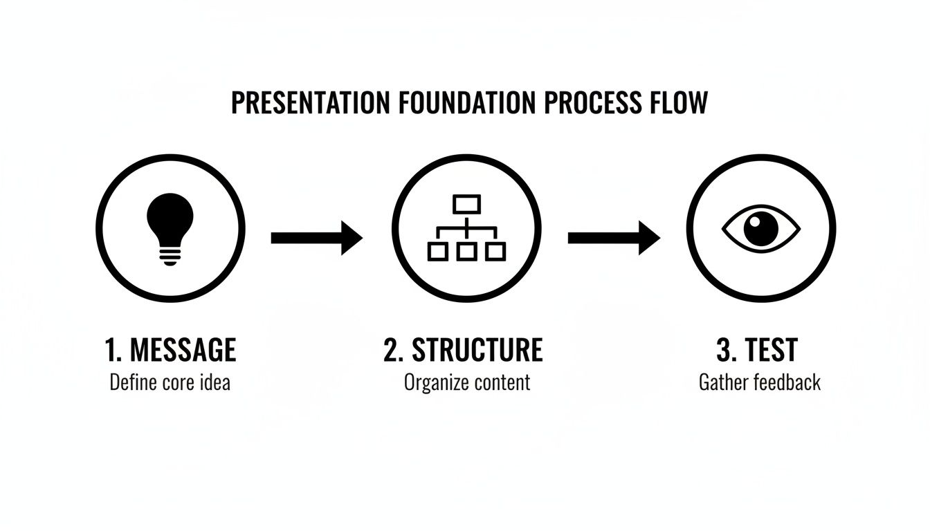
As you can see, the final "test"—making sure your point is understood instantly—is just as crucial as the idea itself.
The ultimate measure of a good slide is what I call the "glance test." If someone can't get the main idea in three seconds flat, the slide isn't working. It's that simple.
Getting your thoughts out of your head and into some kind of order can be a messy process. Honestly, this is where AI has become my secret weapon for getting out of my own way. Instead of battling a blank screen, you can just brain-dump your notes, stats, and half-formed ideas into a tool like Zemith and let it help you find a logical path forward. It’s like having a co-writer who never needs a coffee break.
A quick reference like this table can keep you grounded in the principles that matter most when you start building your deck.
Core Principles for Slides That Stick
Keeping these simple rules in mind will ensure you're building a presentation that supports your message, rather than burying it in clutter. By focusing on your message and structure first, you've already won half the battle before you even design a single slide.
Turning Your Message into a Compelling Story
Your slides are just props; the story is the main event. I’ve seen countless presentations fall flat because they were just a list of facts. People don't connect with data dumps—they connect with stories. This is where we stop thinking in bullet points and start building a narrative that actually sticks with people.

Don't worry, you don't need to be a Hollywood screenwriter for this. A simple, powerful framework can turn even the driest quarterly report into something genuinely engaging. Think of it as taking your audience on a logical journey, one they actually want to follow.
Find Your Narrative Framework
Every great story, from a campfire tale to a blockbuster movie, follows a familiar pattern. You can borrow these same structures to make your message resonate. One of the most effective and versatile frameworks I always come back to is Problem-Solution-Benefit.
- Problem: Start by hitting on a real pain point. What’s the challenge your audience is up against? If you can articulate their problem in a way they instantly recognize, you've got them hooked.
- Solution: Now, bring in your idea or product as the hero of the story. Show exactly how it tackles the problem you just laid out. Be direct and clear.
- Benefit: Finally, paint a vivid picture of the better future. What's the payoff for them? This is the "why it matters" part that inspires people to actually do something.
This structure creates a natural forward momentum. It builds curiosity and makes your final point feel satisfying and earned. It’s a small shift in how you prepare presentation slides for maximum impact that makes a world of difference. As you shape your narrative, you might also find some great ideas in these content repurposing strategies, which can help you see how a single core message can be adapted for all sorts of formats.
Hook Them Early and End with a Bang
Your first 60 seconds are everything. You need an opening that grabs attention and makes the audience lean in. Please, ditch the boring "Hi, my name is..." intro. Try one of these instead:
- Ask a provocative question. ("What if you could get back 5 hours every week?")
- Share a jaw-dropping statistic. ("Did you know that teams waste 20% of their time on tasks that could be automated?")
- Tell a short, relatable personal anecdote. ("Let me tell you about the time my entire presentation crashed mid-sentence...")
Your closing is just as critical. The worst thing you can do is just trail off with a meek, "Uh, any questions?" End with a powerful call to action or a memorable final thought that loops right back to your core message.
The goal isn't just to inform; it's to inspire. Your final slide should be the catalyst that prompts your audience to think, feel, or do something different after they leave the room.
If you’re drowning in research and struggling to find the story, this is where AI can be a huge help. Tools like Zemith’s Document Assistant can comb through a dense report and pull out the key themes and data points for you. It acts like a co-pilot, finding the narrative threads hidden in all that noise, which is a fantastic shortcut for learning how to write engaging content for your presentation.
Designing Slides Without Being a Designer
You don't need a design degree to create slides that look clean and professional. Let’s be honest—the goal isn’t to win a design award; it's to communicate your ideas clearly and effectively. Think of good design as a shortcut to building trust. A clean, modern look instantly tells your audience, "I’m organized, I've thought this through, and I respect your time." A cluttered mess? It screams the exact opposite.
With so many of us working in hybrid or remote teams, this has become even more important. More than 60% of global companies now rely on cloud-based tools like or , where collaboration is key. It shows that putting together a great presentation is no longer a solo activity.
Keep It Clean and Simple
The single biggest mistake I see people make is trying to do too much. They cram every last inch of the slide with text, logos, and funky shapes. When it comes to slide design, your best friend is white space—all that empty area around your text and images. It gives your content room to breathe and makes everything on the slide instantly easier to understand.
Start with these three fundamentals:
- Colors: Pick two or three main colors and stick with them. A primary color for headlines, a secondary for accents, and a neutral for your background is a classic, foolproof combination. Just please, avoid anything that looks like a 90s website exploded.
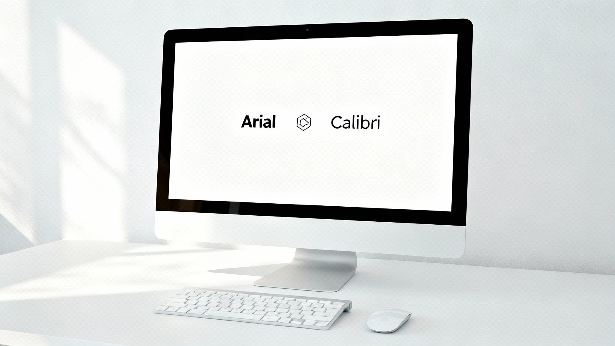
- Fonts: Seriously, just step away from the Comic Sans. Choose one or two clean, readable fonts like Helvetica, Arial, or Calibri. Use one for your headers and another for your body text to create a simple, clear visual hierarchy.
- Consistency: This one’s huge. Use the same fonts, colors, and layout on every single slide. This creates a cohesive, professional feel that lets your audience focus on your message, not your chaotic design choices.
The AI Design Hack
Okay, but what if you're short on time or just not feeling the creative spark? This is the perfect time to work smarter, not harder. Instead of wasting an hour scrolling through stock photo sites or fighting with an image editor, you can let AI do the heavy lifting in seconds.
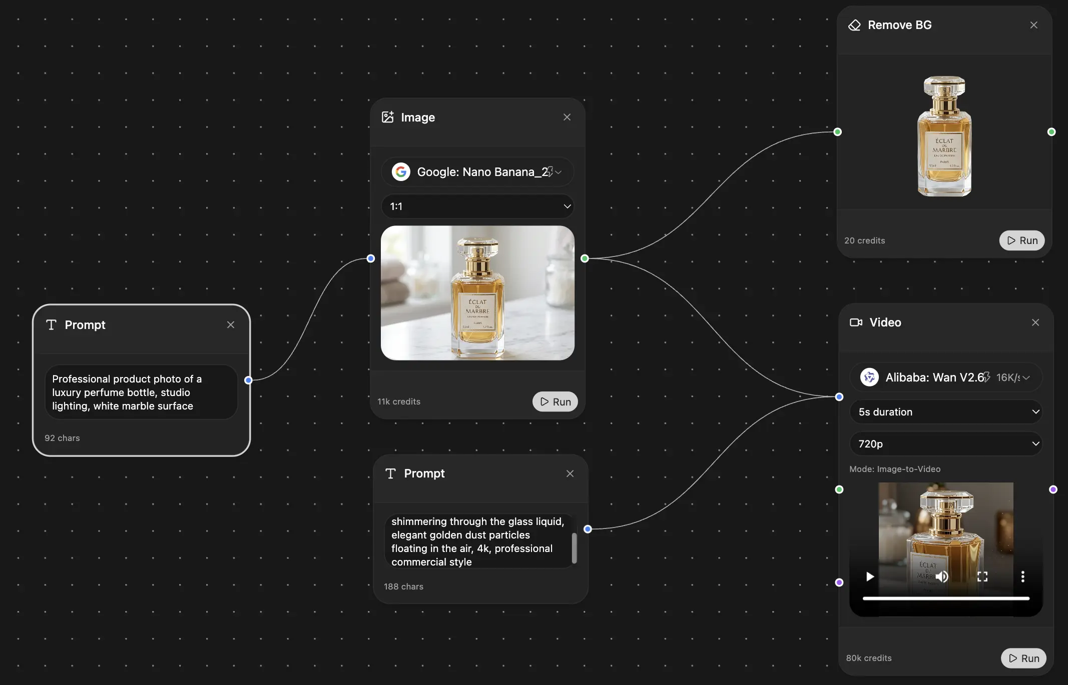
For example, Zemith's Creative Tools let you generate a completely custom image from a simple text description. Need a "cyberpunk cat coding on a laptop"? You got it.
You can generate brand-new visuals or remove the background from a photo without needing to be a wizard. This is a massive shortcut to getting high-quality, on-brand images that perfectly match your message. For some advanced tips on getting exactly what you want, check out our guide on .
Think of AI as your personal design assistant. It handles the tedious stuff, like cutting out the background from a product shot, so you can stay focused on the bigger picture—your story.
This is how you get professional-grade visuals without the professional-grade price tag or timeline. It really levels the playing field, making great design something anyone can achieve, not just the folks with a designer on speed dial.
Making Your Data Actually Interesting
Let’s be honest, the data slide is usually the moment your audience decides to check their email. A screen full of numbers and charts can feel like a pop quiz nobody wanted, causing eyes to glaze over instantly. But your data doesn't have to be a presentation killer. In fact, it can be your most powerful tool for persuasion—if you make it easy to digest.
The trick isn't to show all the data. It's about highlighting the right data. Your job is to be a guide, pointing your audience to the single most important number or trend on that slide. Everything else is just noise.
Choose Your Visual Wisely
Not all charts are created equal, and picking the right one is crucial for getting your point across clearly. Please, I’m begging you, don’t just default to a pie chart for everything.
Here’s a quick cheat sheet for the most common choices:
- Bar Chart: Perfect for comparing distinct categories. Think "sales by region" or "website traffic by source."
- Line Graph: Your go-to for showing a trend over time. Use it to track things like "monthly revenue" or "user growth."
- Simple Table: Don't underestimate it! When you have just a few precise numbers that need to be compared side-by-side, a clean table is often way clearer than a complex chart.
The goal is to pick the visual that tells your story most directly. If you want to dive deeper, check out our full guide on data visualization best practices.
The purpose of a data slide isn't to present a spreadsheet. It's to deliver a single, powerful insight that your audience can grasp in seconds.
Make the Data Pop
Once you've picked your chart, a few simple design tweaks can make all the difference. Try using a single, bright color to highlight the most important bar, line, or number. Then, mute the rest of the data in a neutral color like gray. This simple trick draws the eye exactly where you want it to go.
To make sure your data is both credible and clear, using can be a lifesaver. They help automate finding and fixing errors, which means the data you present is rock-solid. This is more important than ever, especially as cloud-based solutions have captured 45% of the presentation software market, a field that thrives on accurate, real-time data.
For those presenting technical information, you can really step things up. Instead of a static screenshot of code, imagine showing a live preview. A tool like Zemith's Coding Assistant lets you generate and embed interactive HTML snippets or even React components right into your slides. This turns a potentially dry technical demo into a live, hands-on experience that keeps everyone—even the non-coders—locked in.
Rehearsing for a Flawless Delivery
Your slides are polished, your story is airtight, and you’ve wrestled your data into submission. Now what? Honestly, don’t trip at the finish line. A rambling, awkward delivery can sink all that hard work in minutes. This is your warm-up, the final step that separates a good presentation from a truly memorable one.

If you take only one piece of advice, make it this: practice out loud. I'm serious. Thinking through your slides in your head is a totally different game than actually saying the words. You’ll immediately catch clunky phrases, find your natural rhythm, and get a real feel for your timing.
It doesn't matter who your audience is. Your confused golden retriever, a patient houseplant, or just an empty room will do just fine. The act of speaking solidifies the material.
The Pre-Flight Checklist
Before you step on stage or click that dreaded "Start Meeting" button, a quick systems check can save you from a world of technical glitches and last-minute panic. Don't leave this stuff to chance.
- Tech Check: Is your mic working? Camera on? Can you actually share your screen? Give your slide clicker a whirl and make sure you know how to toggle between your notes and the main display.
- Notes Review: Glance over your key talking points. They're your safety net, not a script. You're aiming for a conversation, not a dramatic reading.
- Mindset Moment: Take a few deep breaths. Remind yourself what your core message is. Picture yourself delivering it with confidence. That feeling is something you can practice, too.
Public speaking nerves are completely normal—they just mean you care. The secret isn't getting rid of them; it's learning to channel that energy into an enthusiastic, engaging delivery.
Managing those pre-show jitters is key. And contrary to popular belief, practicing more won't make you forget your lines. In fact, rehearsing out loud is one of the best ways to and build genuine confidence.
Supercharge Your Rehearsal with AI
Practicing alone is good, but getting feedback is even better. This is where AI can be a surprisingly useful speaking coach. Instead of just talking into the void, you can use a tool like Zemith's AI Live Mode to run through your speech.
As you talk, the AI can offer instant suggestions, point out better phrasing, and even help you prep for tough questions you might get from the audience. Think of it as a co-pilot helping you refine everything in real-time. This final run-through is what helps you shift from simply knowing your content to delivering it with an effortless, conversational flow that truly connects with everyone in the room.
Answering Your Lingering Presentation Questions
Alright, you've got the roadmap for strategy, storytelling, and design. But I bet a few questions are still bouncing around in your head. It's totally normal. Let's tackle some of the most common hangups people have when they sit down to build their slides.
How Many Slides for a 20-Minute Talk?
This is the big one, isn't it? Let me be clear: the old "one slide per minute" rule is completely outdated. Please, do yourself and your audience a favor and forget you ever heard it.
The real answer? As many as it takes to tell your story well.
Some of the best talks I've seen use 30 or even 40 slides in 20 minutes. The slides were simple, highly visual, and changed quickly to keep the energy high. On the other hand, a slow, deliberate talk might only need 15. The goal is momentum, not hitting a magic number. It's far better to break one complex idea into five simple, fast-moving slides than to force your audience to stare at a single, dense slide for five minutes straight.
Think of it this way: a good presentation flows like a conversation. You wouldn't count the number of sentences you're allowed to use, right? Focus on the rhythm and the flow.
What’s the Best Font to Use for Slides?
If they can't read it, you've already lost. Readability is non-negotiable. The safest bet is to always stick with clean, classic sans-serif fonts. They are built for screens and project beautifully.
Here are a few of my trusted go-tos:
- Helvetica: The undisputed champ. It’s clean, professional, and never goes out of style.
- Arial: It's everywhere for a reason—it’s incredibly easy to read from a distance.
- Calibri: A slightly more modern and friendly option that still feels professional.
- Open Sans: A fantastic, open-source font designed for screen legibility.
Whatever you pick, just promise me you'll make the body text at least 24pt. And please, for the love of all that is good, make sure your text has high contrast with the background. Black text on a white background is a classic because it just works.
Should I Read Directly from My Slides?
Let's make a pact, you and I. Right now. You will never, ever do this.
Reading your slides word-for-word is the quickest way to bore your audience to tears. Why? Because they can read much faster than you can talk. The moment you start narrating the screen, you've made yourself irrelevant.
Think of your slides as your backup singers. They are there to provide harmony, visuals, and key hooks. You are the lead vocalist. Your slides should only have keywords, powerful images, or simple charts that support what you're saying, not a script for you to follow. They are cues for you and visual anchors for your audience—nothing more.
Can I Just Use AI to Write My Whole Presentation?
Technically, you could. But it's a terrible idea. Think of an AI tool as the world’s most efficient and brilliant research assistant, not as a replacement for your own mind and voice.
AI tools are absolute lifesavers for the grunt work. For instance, you can drop a bunch of messy notes into and have it spit out a coherent outline in seconds. It's fantastic for busting through writer's block, summarizing dense reports, or brainstorming different angles for your story.
But the heart of the presentation—the personal stories, the unique insights, the passion in your delivery—that has to come from you. Let AI handle the heavy lifting. That way, you can pour all your energy into the part that actually connects with people.
Ready to stop staring at a blank canvas and start creating presentations that actually make an impact? Zemith puts all the AI power you need in one place. You can organize your thinking, generate custom visuals, and even get feedback on your delivery. It's your partner for building presentations that connect. See how it works at and feel the difference.
Explore Zemith Features
Every top AI. One subscription.
ChatGPT, Claude, Gemini, DeepSeek, Grok & 25+ more


Always on, real-time AI.
Voice + screen share · instant answers
What's the best way to learn a new language?
Immersion and spaced repetition work best. Try consuming media in your target language daily.
Voice + screen share · AI answers in real time
Image Generation
Flux, Nano Banana, Ideogram, Recraft + more

Write at the speed of thought.
AI autocomplete, rewrite & expand on command
Any document. Any format.
PDF, URL, or YouTube → chat, quiz, podcast & more
Video Creation
Veo, Kling, Grok Imagine and more

Text to Speech
Natural AI voices, 30+ languages
Code Generation
Write, debug & explain code
Chat with Documents
Upload PDFs, analyze content
Your AI, in your pocket.
Full access on iOS & Android · synced everywhere
Your infinite AI canvas.
Chat, image, video & motion tools — side by side
Save hours of work and research
Transparent, High-Value Pricing
Trusted by teams at
Free
No credit card required
- 100 credits daily
- 3 AI models to try
- Basic AI chat
Plus
- 1,000,000 credits/month
- 25+ AI models — GPT, Claude, Gemini, Grok & more
- Agent Mode with web search, computer tools and more
- Creative Studio: image generation and video generation
- Project Library: chat with document, website and youtube, podcast generation, flashcards, reports and more
- Workflow Studio and FocusOS
Professional
- Everything in Plus, and:
- 2,100,000 credits/month
- Pro-exclusive models (Claude Opus, Grok 4, Sonar Pro)
- Motion Tools & Max Mode
- First access to latest features
- Access to additional offers
What Our Users Say
Great Tool after 2 months usage
"I love the way multiple tools they integrated in one platform. Going in the right direction."
— simplyzubair
Best in Kind!
"The quality of data and sheer speed of responses is outstanding. I use this app every day."
— barefootmedicine
Simply awesome
"The credit system is fair, models are perfect, and the discord is very responsive. Quite awesome."
— MarianZ
Great for Document Analysis
"Just works. Simple to use and great for working with documents. Money well spent."
— yerch82
Great AI site with accessible LLMs
"The organization of features is better than all the other sites — even better than ChatGPT."
— sumore
Excellent Tool
"It lives up to the all-in-one claim. All the necessary functions with a well-designed, easy UI."
— AlphaLeaf
Well-rounded platform with solid LLMs
"The team clearly puts their heart and soul into this platform. Really solid extra functionality."
— SlothMachine
Best AI tool I've ever used
"Updates made almost daily, feedback is incredibly fast. Just look at the changelogs — consistency."
— reu0691